I was talking with @gyozaleaf about this a while back, there‘s this aesthetic of big feet and hands that very specifically dates stuff to the early 2000s (though to a degree it’s coming back, as seen on that one Queer Eye Japan episode). Big heads and often round bodies go with it.
There are prototypes of this style, like Asuka 120% (big hands/feet) but that's only in the sprites, and not really in the illustrations.
The earliest big example I can think of is Satoshi Okano's work with Sonic. He did an illustration for a magazine which a higher up at Sega liked, so he was tasked with the cover for Sonic 3D Blast (flicky's island) for Saturn in Japan:
https://gamasutra.com/ckfinder/userfiles/3dreamcast/ga_3dsonic(1).jpg
He then went on to do Samba De Amigo
https://gamasutra.com/ckfinder/userfiles/3dreamcast/samba%20de%20amigo.jpg
We also got SNK's Cool Tool Toon [URL=https://i.imgur.com/MW5ruEv.jpg][IMG]https://i.imgur.com/MW5ruEv.jpg[/IMG][/URL]
And this was the one where, today, I realized some critical limitations of the style. I saw this tweet: https://twitter.com/HANAI_wco/status/1291718919774826497
Wherein a dancer mentions that they were responsible for the dancing from minute 3-10 here:
https://youtu.be/8ZrwvG49ka8?t=184
I asked for more clarification because I was surprised - this game was motion captured? Turned out yes. But when you look at it it's hard to tell, because the big limbs slow everything down, making fast motions appear slower. The lack of real hip and joint action makes everything look stiffer and more anemic. But this was recorded by a proper dancer in a mocap suit!! What the heck. It's interesting how it sort of starts to work once you get to the 45 minute mark and all the dancers are rather large in size?
Anyway let's share some more examples of this style and postulate what the best actual genres for it would be... clearly not dancing. Even Puyo Puyo Da, which has chibis all over the place just makes their heads big and keeps everything else slender enough to see.
I think I was a part of the discussion on that Twitter thread! I tried to explain my 2 cents coming down to the aesthetics' use in games, during that time specifically, pulling from a lot of different hip hop/street art tropes at the time along with ties to rave graphic design.
From my perspective the intent of this style of character design was tied to a distortion of mainstream iconography. Specifically, obviously, the cartoon mascot. Rave pamphlets and electronic music at the time also especially loved screwing with current (for the time) mainstream ad design in a similar way. I can see the synergy of these two anti-commercial ideas coming together in some of these examples of ... well ... commercial products. :P
As for the time and place of the games of the late 90s/early 00s using this visual style, I think there was a combination of commercial attempts to cash in on a trend, there were those art directors truly inspired by it and the moods/ideas it evoked at the time (Jet Set Radio may skirt your definition of the character design style you're referencing, but man ... the art direction definitely tapped into that vein ... what an anti-establishment, yet very commercial product!), and there were artists simply building on top of the latest evolution of an aesthetic that's been around for a while.
I mean ... technically, the larger hands/head/twisty torso of most cartoon characters plays off a theory of expressive hierarchy in figure drawing. The face and the hands evoke a lot of expression, with the placement of the torso following.
*glances at post preview* Gawd ... I sound pretentious as fuck right now ... sorry! Sometimes I brain dump my dumb/obvious viewpoints on the Internet and I read like a jerk. I also wrote all of this and I am drawing an absolute blank on your main question: where this distorted character design was actually used well in games.
@Syzygy yeah, that's where asuka 120% comes in (much bigger hands/feet)
https://i.ytimg.com/vi/THEAIxMPNi8/hqdefault.jpg
And right, the rave culture definitely seems to have been an influence, with some mascot stuff thrown in there. the vinyl toy boom of that era also kind of reflected this I think, with lots of blind toys that had something approaching those proportions.
There's not really THAT much to say about this unless somebody's got some more obscure examples, I mostly wanted to share how poorly mocap works with it!
Somewhere in the intersection between cool cool toon, asuka 120% and jet set radio is slap happy rhythm busters: https://cdn.thegamesdb.net/images/original/screenshots/18824-1.jpg
much further into the jet set radio aesthetic is yanya caballista: https://r.mprd.se/fup/up/151003-Yanya_Caballista_-_City_Skater_%28USA%29-1.jpg
this style evolved for a while and then just kinda dissolved into cel shading I guess.
Rhythm Heaven has some good big feet/hands from its earlier games. I suppose if you build minigames around clapping/dancing on a GBA/DS screen that comes with the territory
I am playing Klonoa 2 right now and what‘s funny to me is the LARGE aesthetic divergence from the first to the second game. What I had forgotten is how 2000s the new characters are! Popka is SO up in the early 2000s vein that it’s kind of jarring to me, frankly.
Final Fantasy Crystal Chronicles (2003) is about to come out again and so I'm looking at the art and realizing the Yukes with their giant stripey hands definitely deserve a mention in this thread.
I‘ve always this problem with the Kingdoms Hearts games, especially the first one. Sora’s design has those big clown shoes that make the awkward platforming feel even worse. It's even more punctuated by the games opening area.
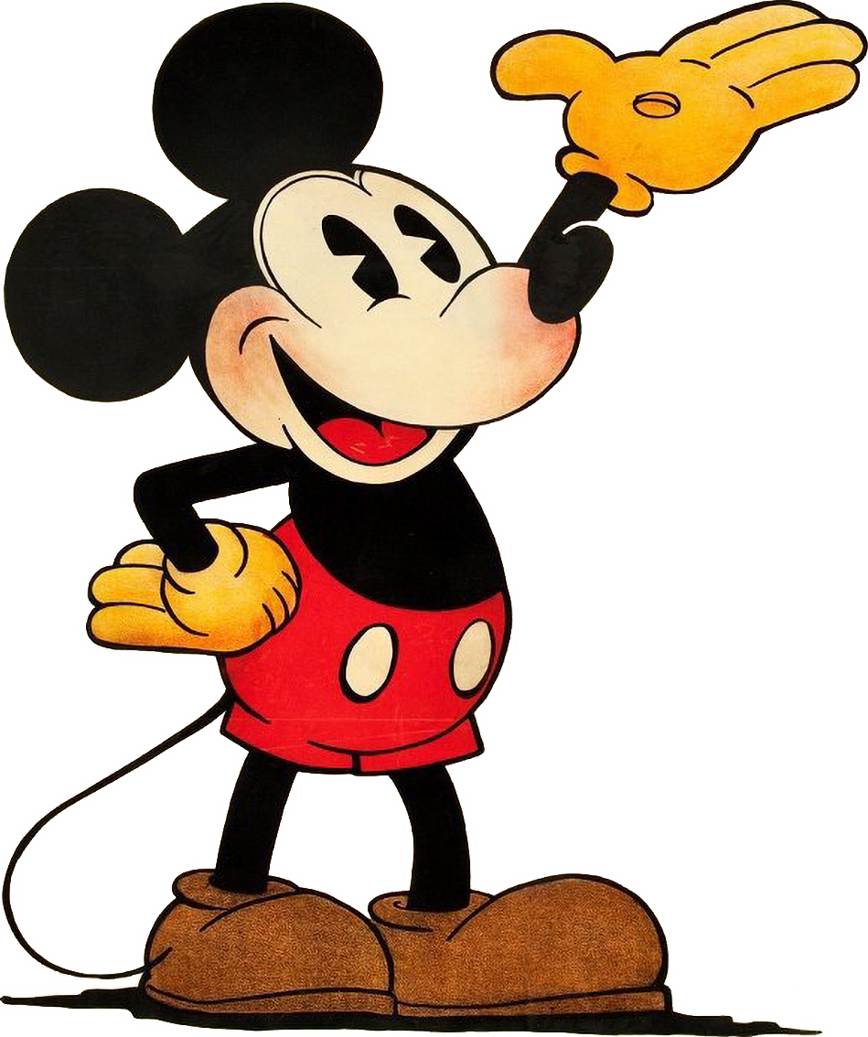
Well, the KH thing is like a double threat – it‘s a symptom of the era of the original game’s release, but it's obviously also a deliberate throwback to classic Mickey Mouse proportions as described above in the thread.
I actually kinda respect KH (at least the first game) for somehow coming up with a unifying aesthetic where Nomura teens and characters from a dozen different Disney movies don’t look like a weird cut-out collage every time they share a frame together. The clown shoes and gloves are a subtle but important part of that.
 https://i.ytimg.com/vi/THEAIxMPNi8/hqdefault.jpg
 https://cdn.thegamesdb.net/images/original/screenshots/18824-1.jpg
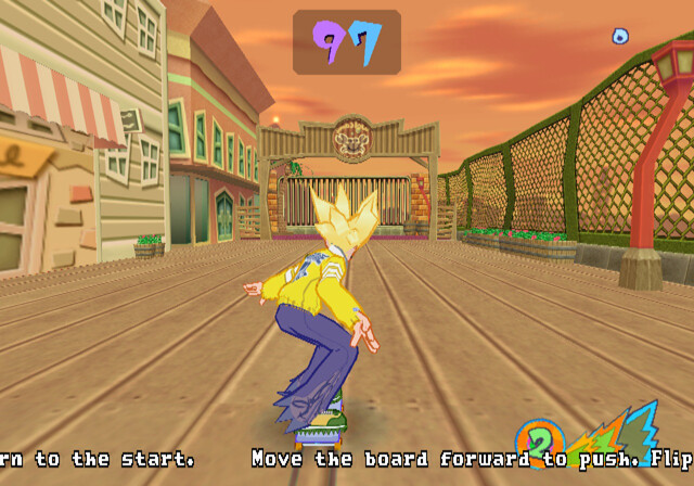 https://r.mprd.se/fup/up/151003-Yanya_Caballista_-_City_Skater_%28USA%29-1.jpg