I heard the total opposite when I saw it
2 Likes
the main purpose of a magazine cover isn’t to communicate information, specially if it’s not one that is going to be sitting on a news stand. the purpose of a magazine cover is to be aesthetically pleasant and striking, and I think that one does it well. a magazine that can look interesting on a coffee table after the game it features has long gone out of fashion is much better than one that isn’t. print is a dying medium, but outside of games, the publications that are managing to survive are clearly playing attention to that aspect, of the magazine as an aesthetic object. Edge was always pretty good at it:
10 Likes
A look at the surrounding circumstances of “booms” is typically pretty interesting to understand their emergence.
Coordination is one of the hardest problems in large scale production, but with open-world games you can “simplify” by focusing on world size. This implies direction toward quantity of art assets, which parallelizes well across different locations. You’d have overall design done at the main studio (typically in a high cost-of-living country/area) and then farm out volume production to third parties or internal studios in low cost-of-living areas.
An example of this can be found in Ubisoft: for FY22, they had ~20700 employees at $2.31B in revenue (circa $111594 per capita). Compare that to Activision Blizzard, which had ~13000 employees at $7.53B revenue (circa $579230.77 per capita) and you’ll realize Ubisoft is much more labor intensive and likely paying its employees much less; consistent with a strategy of focusing on open-world and asset production as main output.
The genealogy of MMORPGs is similarly interesting. Much of the design is based on infrastructure limitations of the era (late 90s to mid-00s): back then, low latency Internet was uncommon as most were still on DSL, cable or even dial-up. MMORPGs work around this by focusing on indirect action(s): using projectiles, area-of-attack moves or automatic targeting.
These days, players are typically on better connections and server infrastructure has become more commoditized thanks to clouds and CDNs. Combine this with the emergence of matchmaking as the main paradigm for entry and you can see how accessibility has increased tremendously. Not only are you more likely to have low latency Internet connectivity and access to servers in close proximity; it is also likely you will be able to find games with similarly skilled players as opposed to being dropped into a session where you are completely out of your league.
4 Likes
gonna say that cover would worked great for a demo song on a mini-cd cut to be the shape of a credit card but still spin
8 Likes
Those covers do communicate information, teasers for the featured articles the month of publication and whatnot!
Most of those covers are perfect examples of splitting the difference between form and function. All the text is very legible, even the importance of the information is communicated by the size and placement of the text.
1 Like
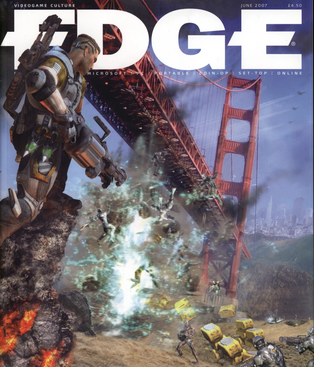
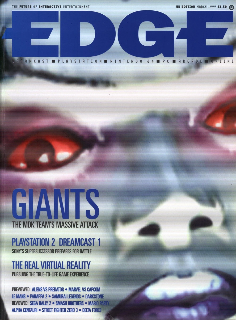
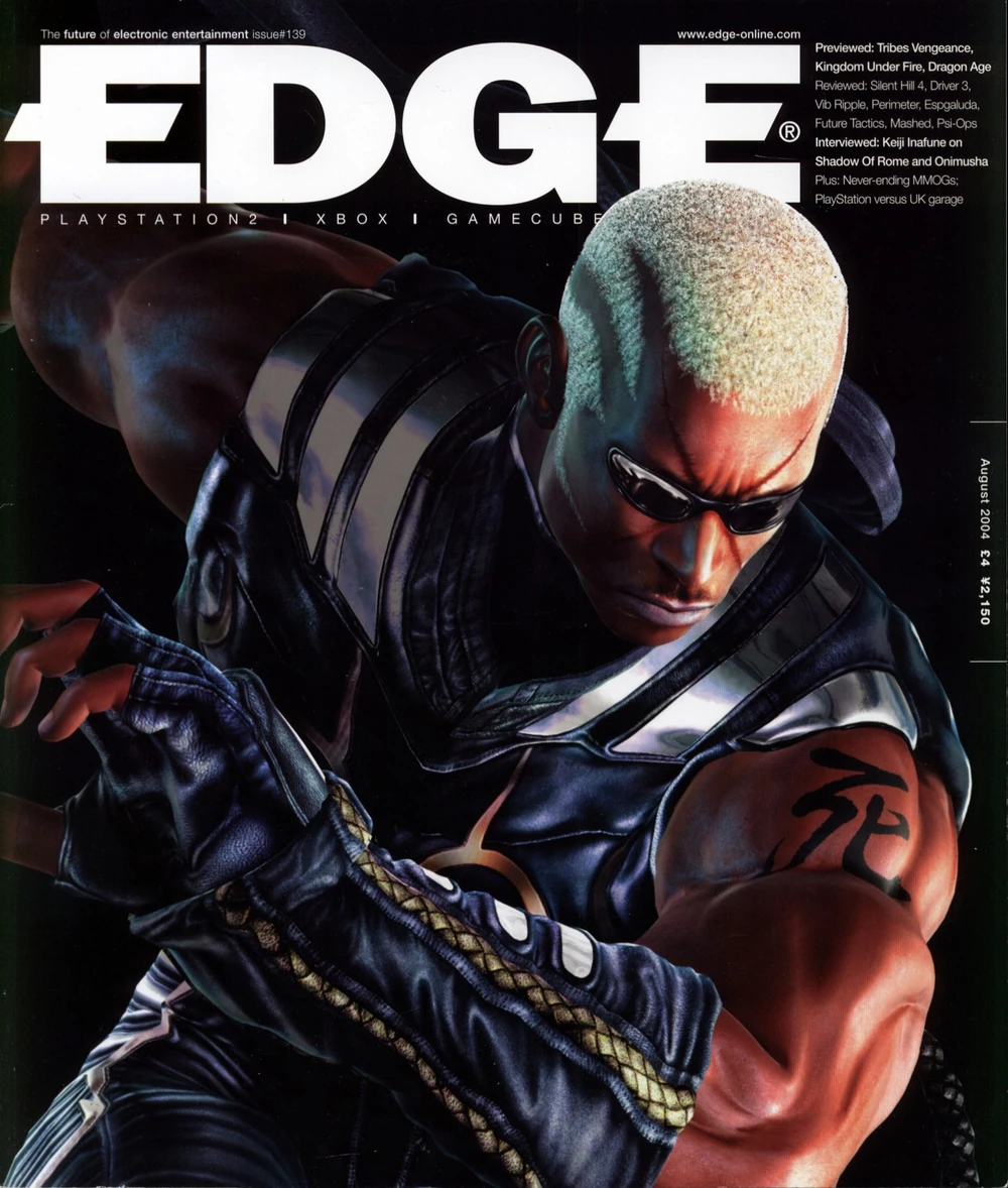
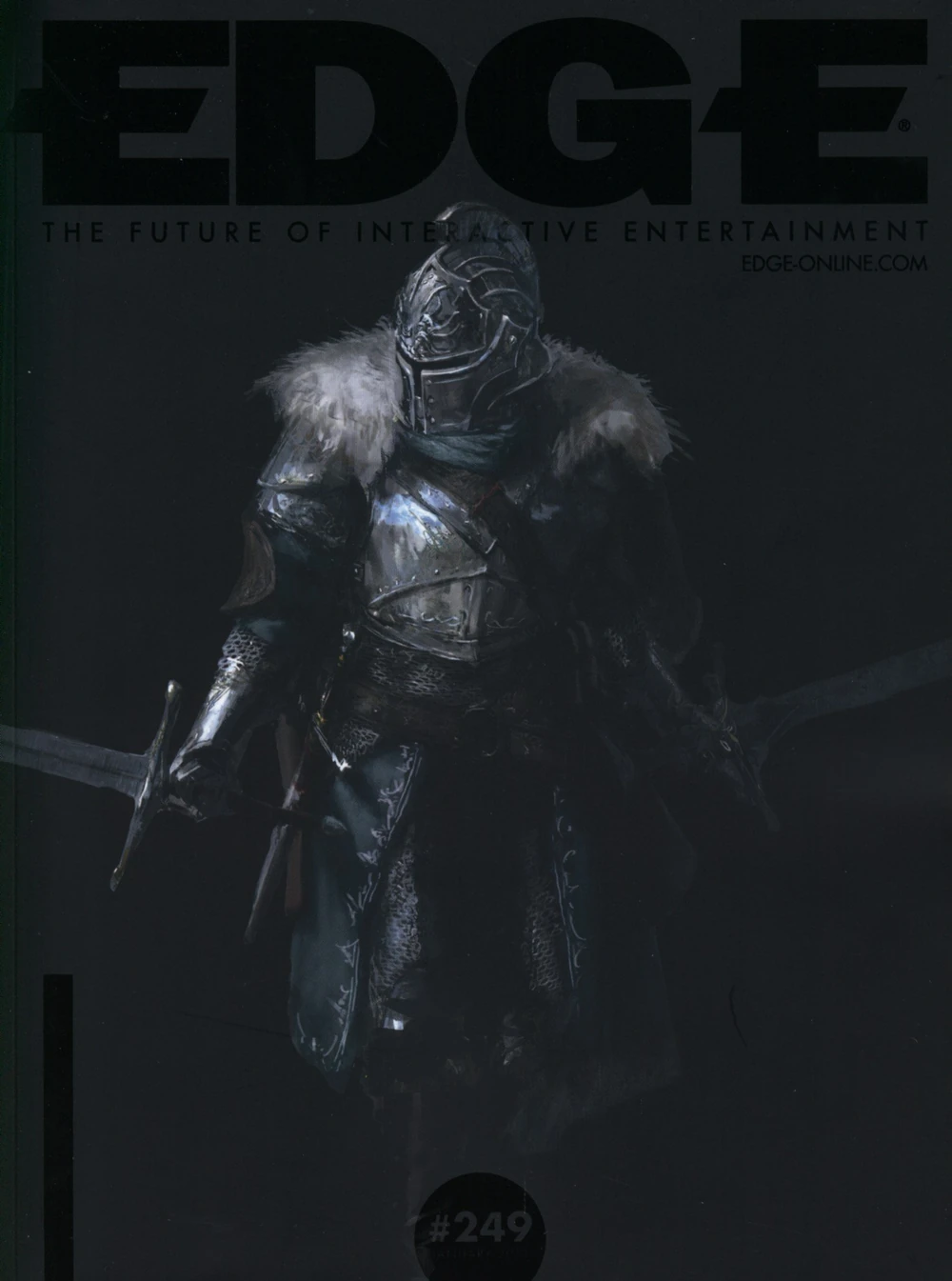
in two of them the dudes are covering part of the logo and the text under it, and in the other two it blends quite a bit with the image. yes, the month is always readable, but the priority is clearly to have an aesthetically impactful cover. in the first one, you’d have to be a real nerd to know it’s about Fracture (LucasArts, 2008), and the character on the left is obscuring the mention of Sony and Nintendo as platforms covered by the magazine; despite all this, I think it looks a million times better than if all that information was clearly communicated.
1 Like
I was really expecting the cover to be worse. The designer is just doing a sort of half-baked David Carson ‘grunge’ style magazine cover like many others did! A bit played out by 2011 but still looks cool to me in 2024 so why not.
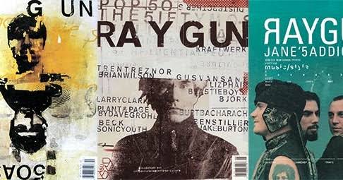
Pretty easy to go that route if you’re trying to make covers look more like an artwork than information dominated. It’s a bit too brown and they look a bit soullessly computer-generated rather than gritty, carefree & collaged but I would’ve guessed that the intention was to keep the Minecraft screenshot from looking too cartoony and kiddy. This is for serious DEVELOPERS after all!
The strikethrough thing was a real Carson go-to, as well as just general type mangling because legibility is for narc’s maaaaaan.
12 Likes
i think the reason @exodus ’s pentagram shirt gets so many compliments is they kinda had a moment a few years ago when this documentary was released:
")
1 Like
A gaming achievement that I always find a little embarrassing is when you get paired up with an actual child at some sort of event. I like to play a lil smash here and there and I’ll show up for a local event now and then because it’s fun to compete and I’m pretty good, but invariably this means I will end up crushing the dreams of a <14 year old. That doesn’t feel good for anyone involved.
I also remember that when I was in Japan I saw the store I was in had some Pokken tournament cabinets so I gave it a spin. I destroyed someone thinking it was a CPU but then I realized I was playing against the 4 year old kid around the corner lol
9 Likes
@powderooze YES, that’s the name of the guy I couldn’t remember, David Carson. He really liked that guy’s style and was also in two grunge bands. Our art director was either a student or mentee of his or just influenced by him because of the music connection, but as far as I recall he WAS from texas, so it could’ve been the former. thanks for jogging the memory there!
@MoH that might be it! I did not know about this documentary and haven’t seen it. One thing I didn’t mention is I have two pentagram shirts which I got at the same time for 5 bucks - one has a design as well as the logo (a big woodblock print-looking crow), and one only has the logo, and only the sparse logo one gets compliments!
and now I’m reading up on this and seeing bobby was arrested for elder abuse and I’m not so sure I should wear these shirts anymore!
5 Likes
woah i did not know that but cannot say i’m exactly shocked. he seemed like a pretty messed up dude with an equally messed up parental relationship.
1 Like
I think frank was thinking the right thing with the t shirt question, but you might have to take it farther from asking for help and into emotional hostage taking territory to be sure of getting a compliment. Specifically I was thinking you’d board like a crowded bus at rush hour and announce you’ll start performing a track off your mix tape unless someone says nice shirt. I think that would seal it
5 Likes
I think frank’s greatest innovation here was the idea of paying someone a dollar.
8 Likes
How about adding in a variant of this fit (yes I watched it on basic cable)
edit: I should be clear, a positive version lmao
4 Likes
what if you needed to wear a video game shirt for a year but it anyone gave you a compliment on it, you would die?
what shirt could be so unappealing to even avoid ironic compliments?
9 Likes
Might I suggest a shirt with Mario on it saying “Please don’t compliment my shirt or I will literally die.”
On a more serious note, I think this version might be way more difficult. You’re bound to get someone mentioning your shirt just because it has to do with video games. I feel like even the most obscure reference would net a “hey cool shirt” regardless of if it is based on recognizability or not.
5 Likes
I think the content of the shirt doesn’t matter as long as it fits very, very poorly
10 Likes
unfortunately with all these ideas you might still get a sassy teen ironically saying “nice shirt grandpa” etc
6 Likes
i have a few ideas that, while funny, are too crude for the sophisticated people of this forum
4 Likes