Hot Font Talk

Fonts and typefaces are important for product branding and recognition even if most people will never recognize them or their names. Typeface choices are often are inextricable from logos. Games have all the same uses for typefaces: to communicate information to the player, to contribute to the overall graphical design of the game, and to contribute to branding.

I am not a graphic designer. I’m a baby typography nerd and this thread is inspired by two things. The first is the book “Arcade Game Typography” by Toshi Omagari. It's delightful and you should go check it out from your library. I learned a bunch about fixed-width fonts in general, the specifics of the constraints that arcade games imposed, and even learned new things about classic arcade games in general. The book is full of Insert Credit anecdotes where they discuss the typefaces and also make some comments about some extremely esoteric games.

The other inspiration for this thread is this upcoming new change to the Microsoft productivity suite.

Every time I see the font named “Aptos” I think of the planet Atropos from Returnal, one of my favorite games the last few years. That’s unrelated, but it’s a glitch specific to my own brain that you should all know.

As I said, I really can’t identify too many fonts in isolation (except for maybe Papyrus (ha)), but I certainly yelled into my headset how Heroes of the Storm uses “Neo Sans” most conspicuously for the final queue countdown. My friends yelled back at me to be quieter and stop being a dork. I recognize it because my company used it for quite a while in all their external marketing communications. It's an OK font. I kind of like some of the roundness of it, but it may be just because I had been exposed to it daily for the better part of a decade.

For arcade games, I really dig fonts that have a colored stripe in them. It‘s something that you don’t usually see in the wild, but the medium of an arcade game is more accepting of colored text.

I guess I’d be remiss if I didn’t discuss how Roguelikes all have a big dependency on fixed-width typography for their look at feel, but I’d be lying if I said I have put much time into anything text-mode since Castle on DOS. I play Dungeon Crawl Stone Soup with the Webtiles interface.

The final “work” font I reach for is Source Code Pro. I do just enough programming that it‘s helpful to have a super-legible “programming” font and even though I’m sure there are some great terminal fonts included in default desktop OSes these days, I get to feel like a hipster by having Source Code Pro on all my computers.

For fun, everyone should go check out this amazing resource:
https://caveras.net/

I discovered this site looking for technical information about the Nintendo DS font and instead, I found a website full of well-designed (to my eyes) fun fonts, including a DS-inspired one and including an SMT-inspired one.

Please post your favorite use of typography or fonts in or around games (or not). Bonus points will be awarded if you somehow set your post in your favorite font.

2 Likes

Every time I see the font named “Aptos” I think of the planet Atropos from Returnal (one of my favorite games the last few years). That’s unrelated, but it’s a glitch specific to my own brain that you should all know.

The first thing that came to my mind was apoptosis.

The most exciting thing about Aptos/Bierstadt is that it used to be called “Bierstadt”. I'm going to take every opportunity I can to remind people I liked Aptos better when it was called Bierstadt. I think I like Tenorite the best out of those Microsoft fonts.

Damn it. I was just about to start writing, and then I had to see a thread on fonts.

Working down from the most general to the least general, there's [this resource on, well, identifying fonts used in commercial art](https://fontsinuse.com): advertisements, movie posters, video game boxes etc. Similarly, there's [this Twitter account dedicated to identifying fonts used in the world of video games](https://twitter.com/Fontendou?s=20).

Of course both are working with commercially licensed fonts, meaning there's no real guarantee you can easily use the font yourself should you want to create some Photoshop monstrosity for a given game. That's why I gathered this list of fonts long ago on Cohost and am reposting them here:

  • - Playtime With Hot Toddies (Katawa Shoujo)
  • - [Angelic](https://fontsgeek.com/angelic-font) (Yoko Taro games in general)
  • - [Comic Hearts](https://www.reddit.com/r/KingdomHearts/comments/dexmtv/discussion_so_ive_finally_recreated_the_kingdom/) (*Kingdom Hearts*)
  • - [Brushstrike](https://fontmeme.com/fonts/brush-strike-font/) (Terry Bogard's hat)
  • - [Espionage](https://www.fontsaddict.com/font/espionage.html) (*Metal Gear Solid*)
  • - [Mario & Luigi](https://www.fontspace.com/mario-and-luigi-font-f3398) (You tell me.)
  • - [Morpheus](https://www.dafont.com/morpheus.font) (I think this is the *Quake* logo?)
  • - [Pricedown](https://fontmeme.com/fonts/pricedown-font/) (*Grand Theft Auto*)
  • - [Textile](https://fontsgeek.com/fonts/Textile-Regular) (*It's Always Sunny in Philadelphia*)
  • - [The *Guilty Gear Xrd* font](https://www.reddit.com/r/Guiltygear/comments/5sa2kd/guilty_gear_xrd_font_work_in_progress/) (It's there in the name.)
  • - [*Shining Force*](https://fontstruct.com/fontstructions/show/1624093/shining-force-large) (Again, it's in the name.)
  • Oh, and then there's [Hylia Serif from *Breath of the Wild*](https://artsyomni.com/hyliaserif).

    Here’s a font post I made a while back in the theme sale thread https://forums.insertcredit.com/d/297-theme-sale/241

    I won‘t be able to identify them as much, but I will be watching this thread and taking notes, because I’m a (casual) font slut. Big font appreciator here. Starting from the top of my head, lots of shmups have great fonts.

    Metal Black's title screen makes four very distinct fonts, fonts that you'd think would clash, somehow work in the same space:
    [URL=https://i.imgur.com/CHuCE5F.jpg][IMG]https://i.imgur.com/CHuCE5F.jpg[/IMG][/URL]

    And Radiant Silvergun has a type of simple, straightforward pleasantly legible, arcade-style pixel font (like something that would be in that book), but the way the text is arranged on the famous "be attitude for gains" message really massages my brain -- I love the use of the larger red font with the underline, the satisfying numbered bullets and the choice to leave space on either side of the colon. I suppose it's more about kerning, spacing and layout, but I like it:
    [URL=https://i.imgur.com/kQJblub.png][IMG]https://i.imgur.com/kQJblub.png[/IMG][/URL]

    Here is some font nerd talk about Microsoft changing their fonts.

    I also have "Arcade Game Typography" sitting in my stack of (too many) books.

    The PSP has some games with really nice geometric fonts. Coded Arms and the various Metal Gear games by Konami, Wipeout Pure/Pulse by SCE Studio Liverpool and the Ridge Racer games from Namco are hot.

    https://www.mobygames.com/game/23557/coded-arms/screenshots/psp/178495/
    https://www.mobygames.com/game/16662/metal-gear-acd/screenshots/psp/176452/
    https://www.mobygames.com/game/17331/wipeout-pure/screenshots/psp/223860/
    https://www.mobygames.com/game/20256/ridge-racer/screenshots/psp/227338/

    I read Gruber regularly and value his opinion on many things. He also some times comes off as a bit of a curmudgeon and his typography posts are like that to me. I literally cannot tell the difference between Helvetica and Arial (but I can now) so I may be in the wrong market for that post. However, I do agree with him on several things.

    Microsoft totally blew the messaging to the point that I don't know what they have achieved or even were trying to achieve anymore. They had a list of fonts and then sat on them for a full year. Then they made a weird blog post announcing a name change and a default change on Medium. Gruber's criticism is totally valid. It's not integrated into a larger branding change across Microsoft, it's just for this one corner of dorks in M365. 🤷🏻‍♂️

    i posted about it elsewhere on the forum but i love that the katakana for this famicom game, donaldland, is somehow a japanese version of cooper black — it looks hand drawn and so probably not an extant typeface of any sort, but i wanna know the story behind this

    [URL=https://i.imgur.com/X9EfwtH.jpg][IMG]https://i.imgur.com/X9EfwtH.jpg[/IMG][/URL]
    [URL=https://i.imgur.com/wMajKzM.png][IMG]https://i.imgur.com/wMajKzM.png[/IMG][/URL]

    1 Like

    @“tomjonjon”#p126907 god i love this kind of millennium-era graphic design. the designers republic were (still are i suppose) absolute masters and what they did for the wipeout series is untouchable

    https://www.thedesignersrepublic.com/wipeout
    https://imjustcreative.com/wipeout-logo-history/2023/01/18

    i love the lil touch of the minutes and seconds apostrophes in Wipe'Out" being there cuz like, yknow, it's a racing game and in the wipeout 3 logo it becomes even more abstracted and become dots under the title

    Oh, I forgot to mention this as an old person:

    I played the Diablo 4 demo a while back and was both shocked and delighted that I could read the text throughout the game while sitting on my couch. This is a genuine compliment. I had to play Let It Die standing because I couldn’t read anything because the typefaces were set way way way too small.

    I do subscribe to the theory that game devs now do 4K development on a 30"+ monitor sitting at desk distance and the UX people don't bother to check what couch distance is on a TV.

    N++ also looks good as hell

    [URL=https://i.imgur.com/cGhL4iG.jpg][IMG]https://i.imgur.com/cGhL4iG.jpg[/IMG][/URL]

    ~(i put it on my 2023 top ten list in the vote but nobody else did hmph)

    The Silver Case main menu.


    @“HyggeState”#p126936 god damn those pixel-heavy lines around all those blobs of polygons is reeealllly doing it for me

    The thread made me realize I always liked the font used in Super Monaco GP. Italic, caps, and a chili pepper J. It‘s sort of like Shining Force’s slightly meatier sibling.

    Just found this site because I'm doing something insane to celebrate EVO, but this is the Font Thread and these are some Good Fonts.

    I like Spirax, which is free online and I use for my site. (color design and linework under development)

    [URL=https://i.imgur.com/rgE5WlJ.png][IMG]https://i.imgur.com/rgE5WlJ.png[/IMG][/URL]

    The score/UI font for Galaga Legions is extremely of its time and pretty cool, but totally illegible when you're trying to glance at your high or current score:

    Neat aesthetic, though. It seems to have stuck around for a much shorter span than the ongoing Cyperpunk Lite/vaporwave sunset/neon pink and blue thing that still persisting nowadays. While the fonts have some of the same inspirations as Wipeout, the game itself embraces that sort of post-Geometry Wars art direction of absolute lightshow overload that still manages to be eminently legible during play. Fonts excluded, because they‘re no way you’re reading 'em when things look like this:

    [URL=https://i.imgur.com/r0eowE8.jpg]

    I like a little skeuomorphism as a treat

    [URL=https://i.imgur.com/eX5NVnU.jpg][IMG]https://i.imgur.com/eX5NVnU.jpg[/IMG][/URL]

    1 Like

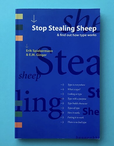
    @“antillese”#p126785 since you mentioned that you are a baby type nerd, i have to recommend this book to you :


    2 Likes