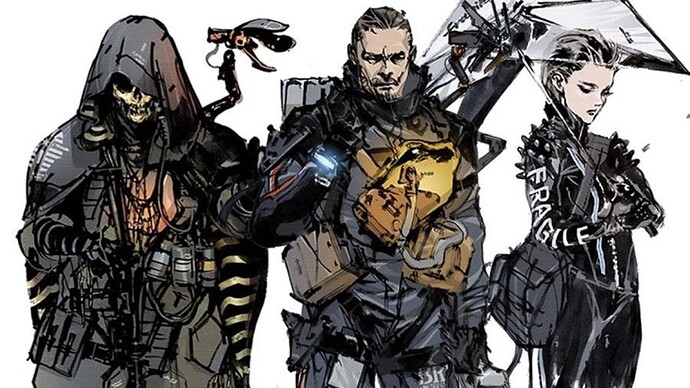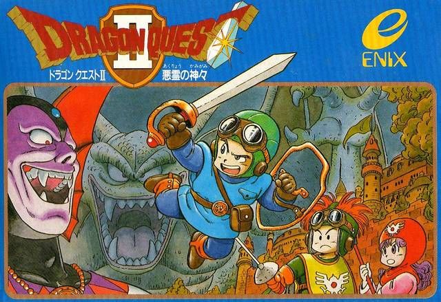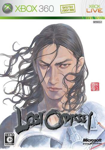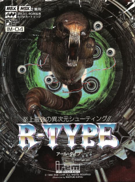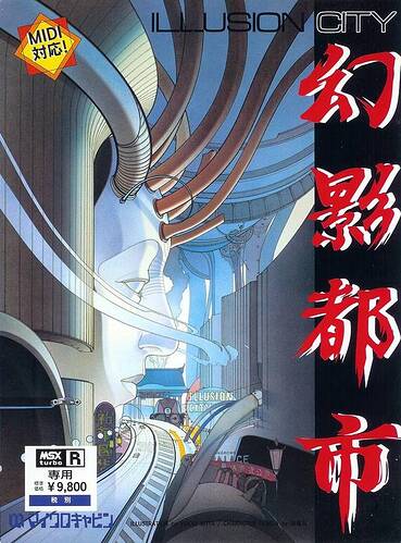
posting Shinkawa cover art feels
like cheating. it’s too powerful. death stranding 2 should be bold and have illustrations of the famous actors on the cover. we know who’s in it! give us the INKY ART!
here’s another one i always liked
That guy HAS to be inspired by Evil from Time Bandits.
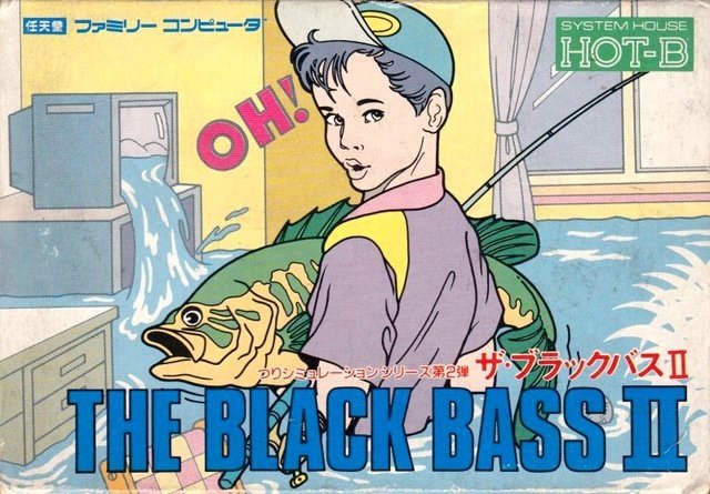
Black Bass II is goated art can’t believe I haven’t seen that one
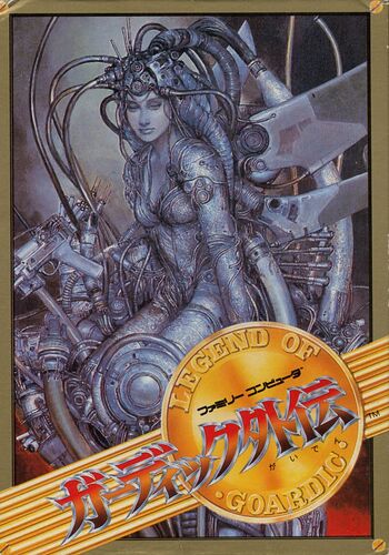
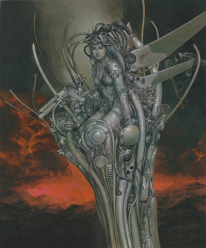
Sorry, I see now that phylaxis already posted that Guardian Legend one. Here are a few more to make up for the redundancy:
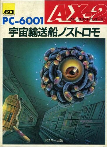
AX-2
(Sometimes considered the first survival horror game, I think.)
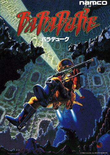
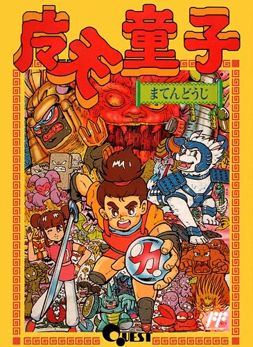
Baraduke
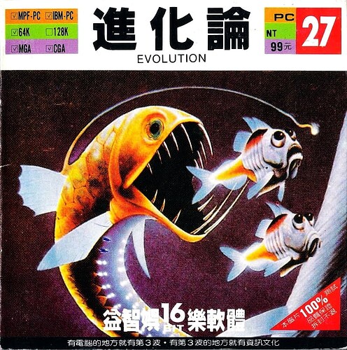
Evolution
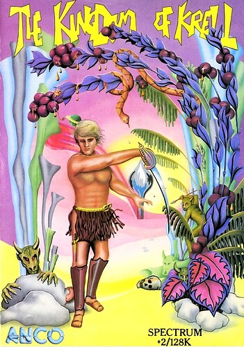
The Kingdom of Krell
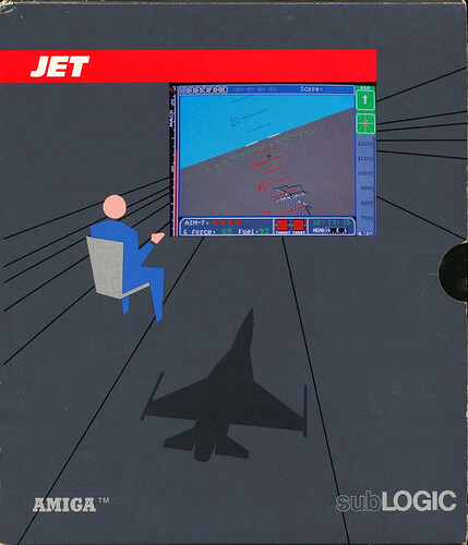
Jet
no need to apologize, it’s an all-timer and probably my favorite ever so keep it coming!
i think i posted this elsewhere on the forum but a couple years ago when twitter was still twitter i did some research and found the original artist there, and asked in serviceable-enough japanese if there were prints or posters or anything i could get and he directed me to an online shop with a pretty generously sized print, framed and everything, that would have cost like $350 shipped from japan. there were a couple times i almost got it, and the exchange rate kept getting better, then one day the store just closed down and i’ve been kicking myself ever since that i missed my opportunity ![]()
idk i could maybe reach back out and see if that print is available elsewhere but money is way tighter now for me anyway but agh. i keep imagining how good it would look on this chunk of the wall next to my desk
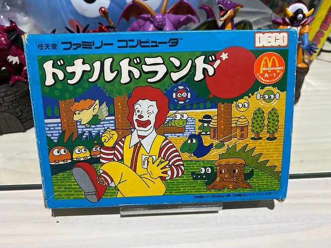
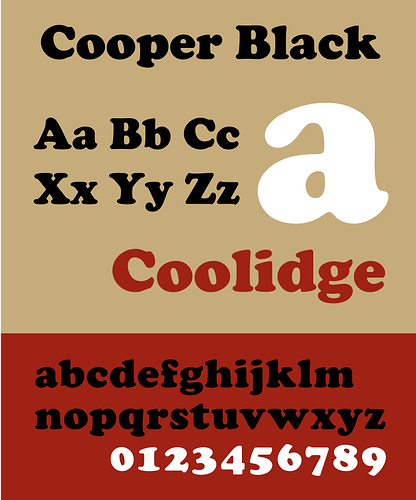
ooooh also that baraduke logo is HOT. reminds me that i’m gonna (re?)post this one for font reasons… DONALD LAND for the family computer:
ok the box art itself is whatever but the really cool thing to me is the logo here, the katakana ドナルドランド …pretty sure it’s freehanded and not like, designed by a type foundry, but i bring it up because it’s somehow a version of the font Cooper Black smashed into japanese type, serifs and all!
(cf. tyler the creator’s “goblin,” the beach boys’s “pet sounds,” top ramen and tootsie roll packaging, etc)
i feel like this must have been made as a one-off thing for this box art by the artist, but i don’t know nearly as much about japanese typography as i do latin scripts so maybe it’s acuatlly a for reals typeface out there? idk, either way, i love the weird little footnote of it all. i feel like the bloopy terminal serif bits of cooper black (that reference actual serifs that originated in ancient greek stone carving) don’t really have quite the analogue in japanese writing which is based on brush strokes? obviously things have changed and evolved massively in modern/digital typesetting days so those kind of “rules” are malleable but this donald land logo is SOMETHING and i love it
And the alternate unused cover art:
A few more favorites:
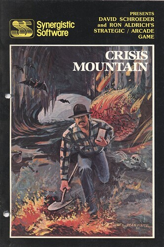
Crisis Mountain
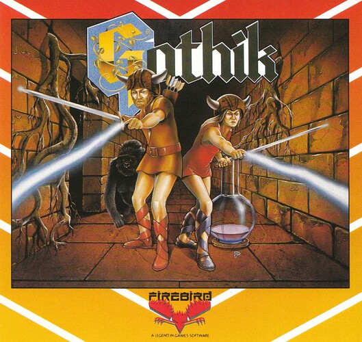
Gothik
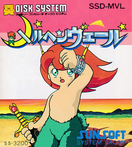
Marchen Veil
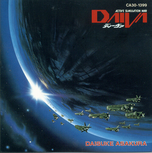
Daiva
(Technically the soundtrack but same art.)
What great art, through and through. I was game shopping the other day and the shop had an Atari section, but sadly, no Haunted House to be found. (My favorite 2600 game.)
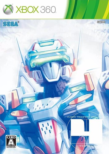
That “4” on there is just so effortlessly cool.
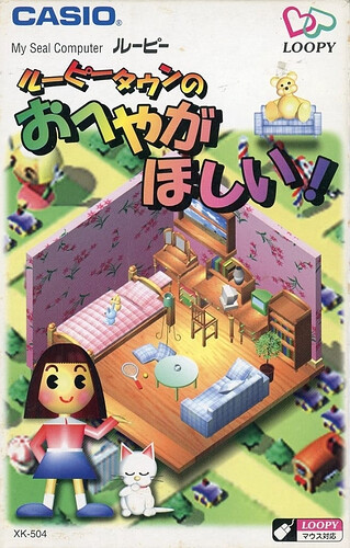
Loopy!!! ![]()
