A lot of games released originally in Japan are kind of infamous until recent years for having either boring (ex. the lovely Akira Toriyama art of the original Dragon Quest games versus the very generic fantasy illustration of the NA versions) or downright awful (ex. the infamous Mega Man cover) box art that tries to make it “more appealing” to Americans. However, sometimes games ended up getting even better box art upon localization. Which games do you personally find the NA box art to be more appealing? Feel free to shout out PAL or other regions if they differ from NA or Japan!
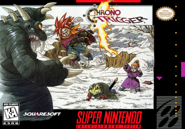
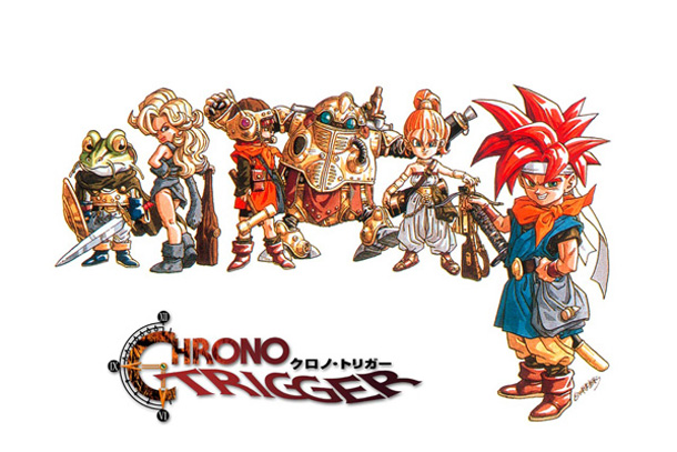
For me, it’s Chrono Trigger. It’s sorta the opposite of what I described with Dragon Quest on NES where the NA version got the way more vibrant Toriyama art. The original art is still great, but having this fully illustrated battle scene instead of just the character desings over no backgroud is way more beautiful.
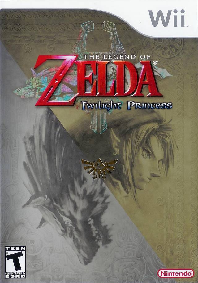
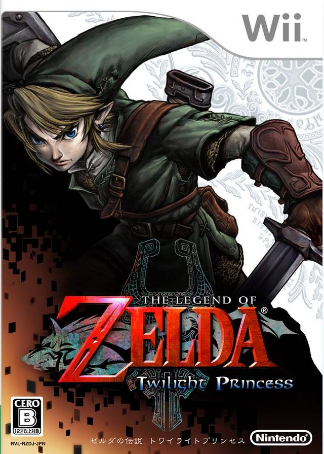
@captain Definitley agree with the Twilight Princess pick. The Japanese cover feels like kinda like the Chrono Trigger one where it's just character art with no real design sense while the NA cover fits the Zelda vibe.
@captain the JP cover is so bland. I was looking at TP‘s boxarts just this week after something made me think “was the dev team reading a lot of Berserk when they made this?” and I’m still not sure if I'm on to something or not.
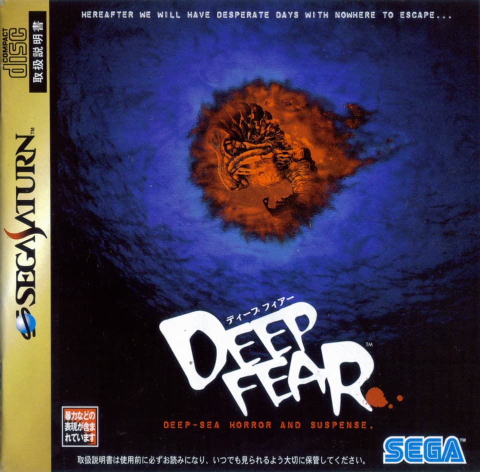
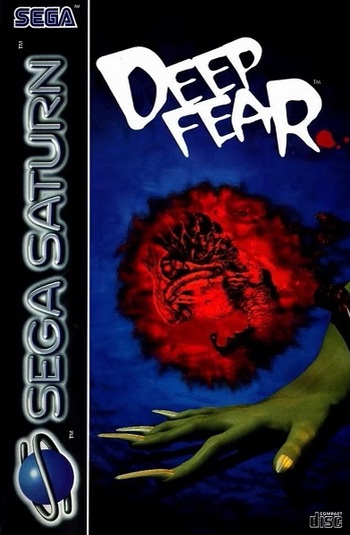
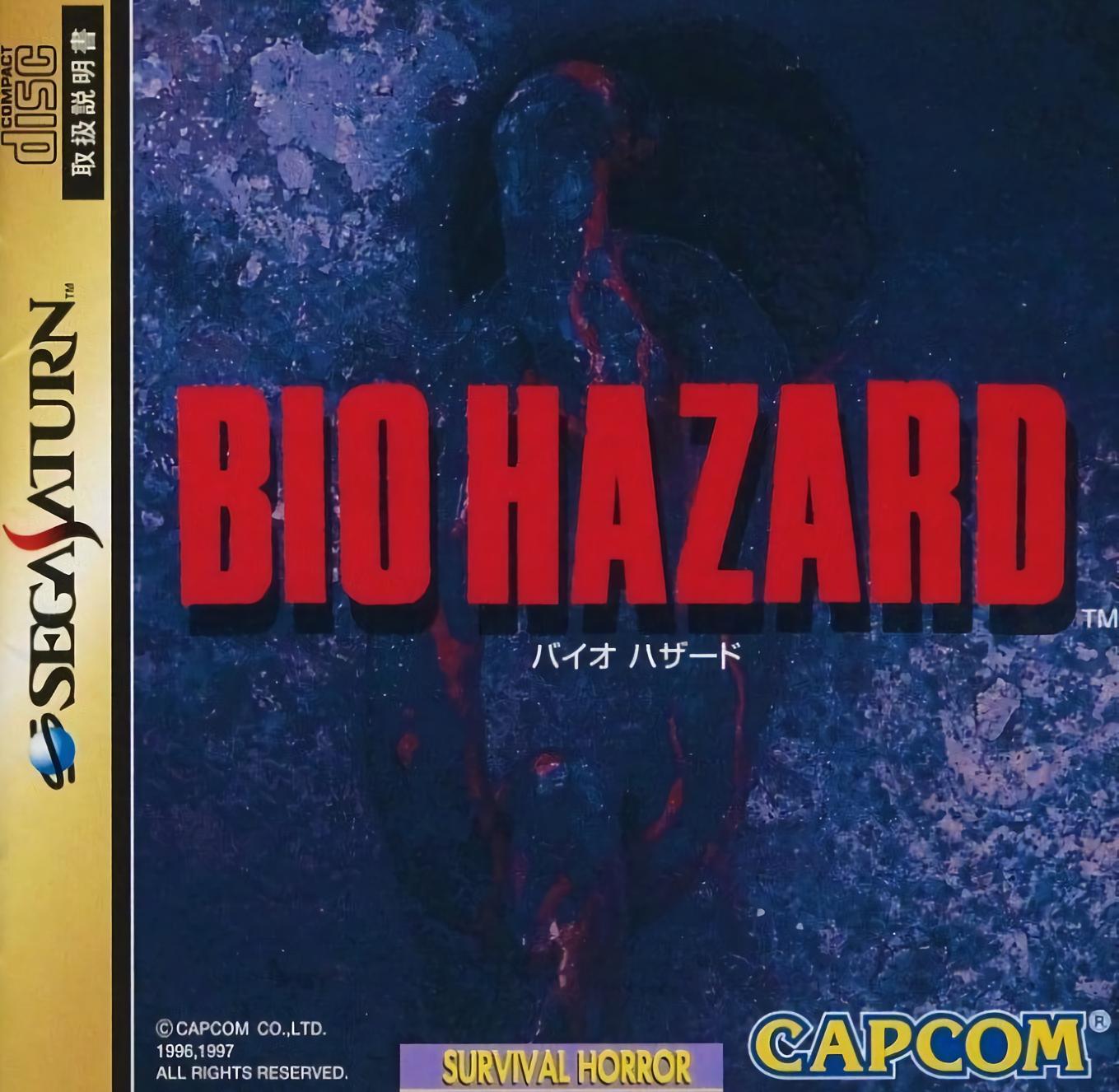
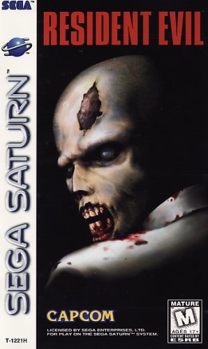
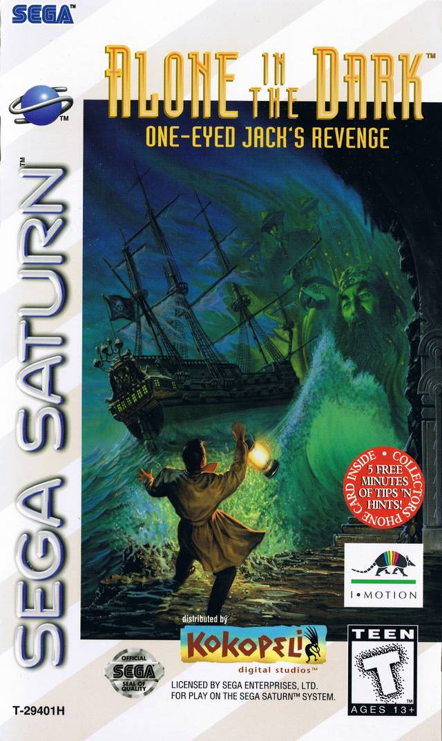
Probably due to ratings concerns for cover displays, western versions of survival horror games on Saturn are pretty universally more interesting. Better is of course debatable but I’d rather look at the western ones.
(no ambiguity as to whether deep fear was trying to ape the biohazard cover eh?)
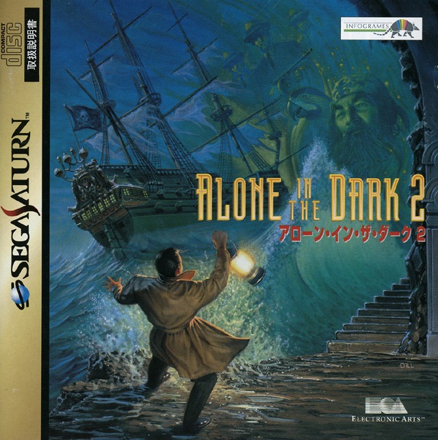
Alone in the dark (this is very debatable but you get to see more of the art and part of me likes the complete mess of textures fonts and shapes this cover represents)
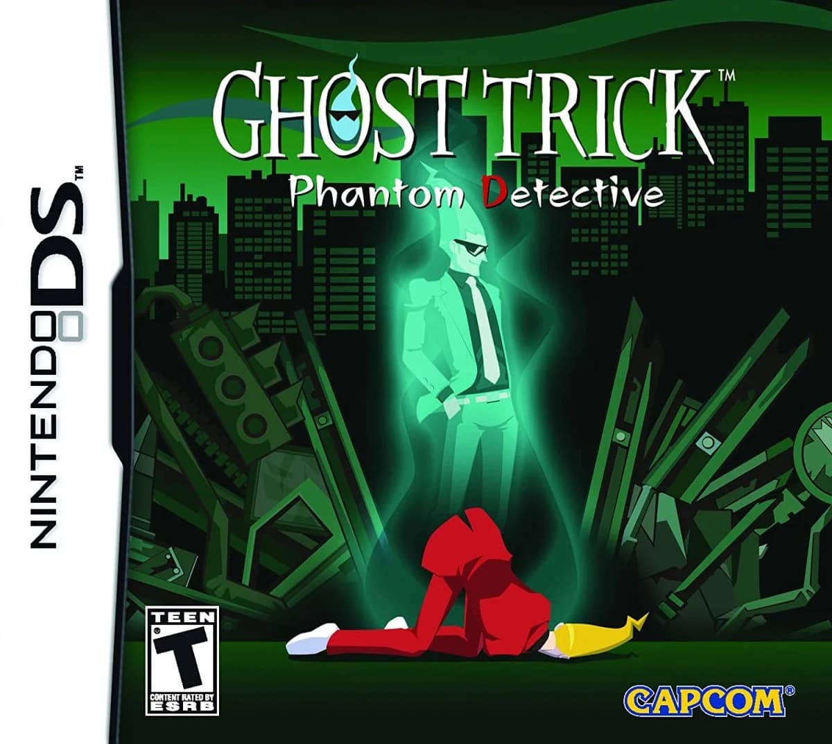
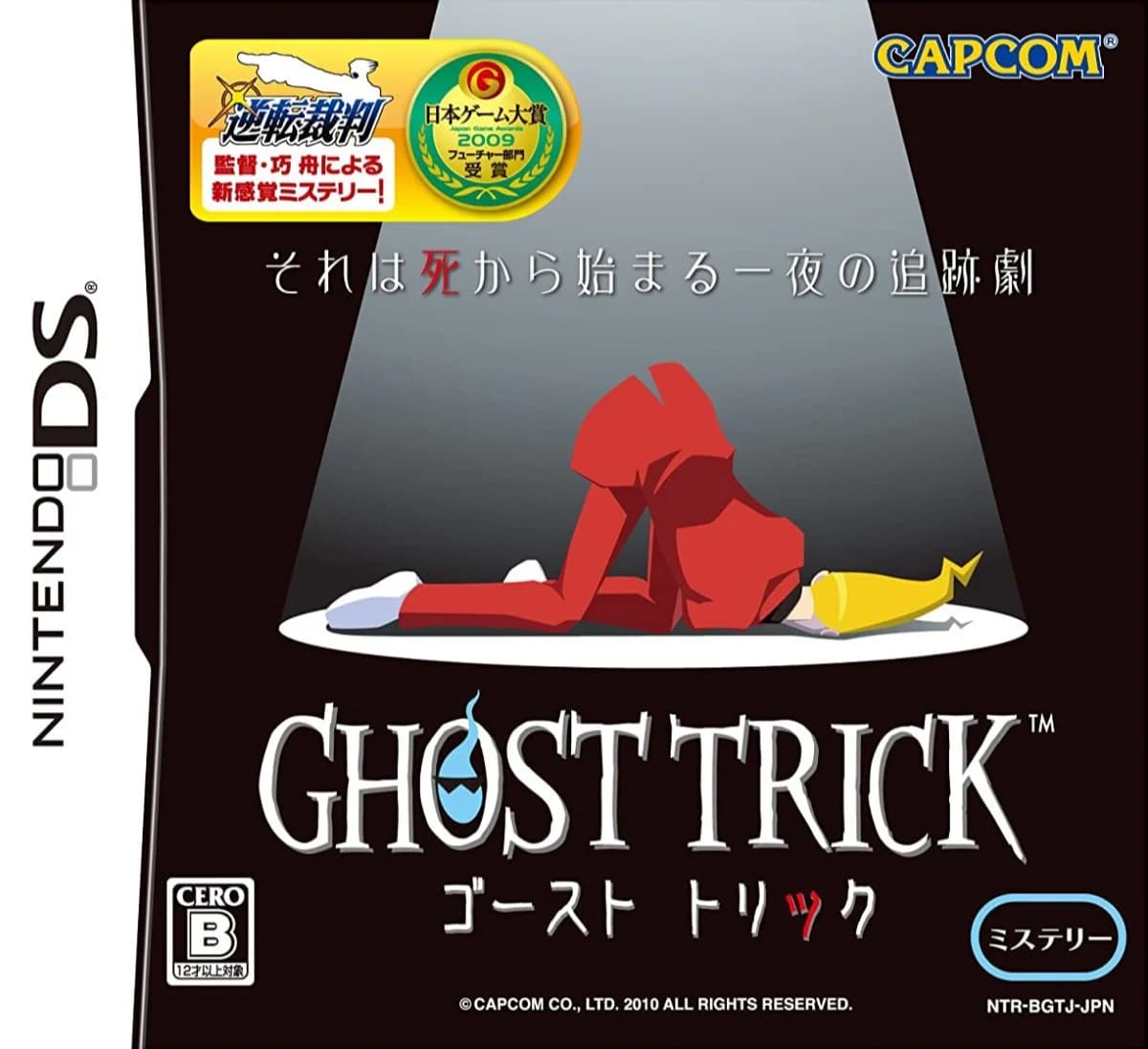
I don’t know that it’s strictly better, or that either cover’s all that amazing, but I thought Capcom USA did a good job augmenting the original Ghost Trick box art to better communicate the nature of the game to NA players without any of the Japanese mystery iconography (but maybe they should have kept the “from the makers of Ace Attorney” notice, seeing as nobody bought Ghost Trick):
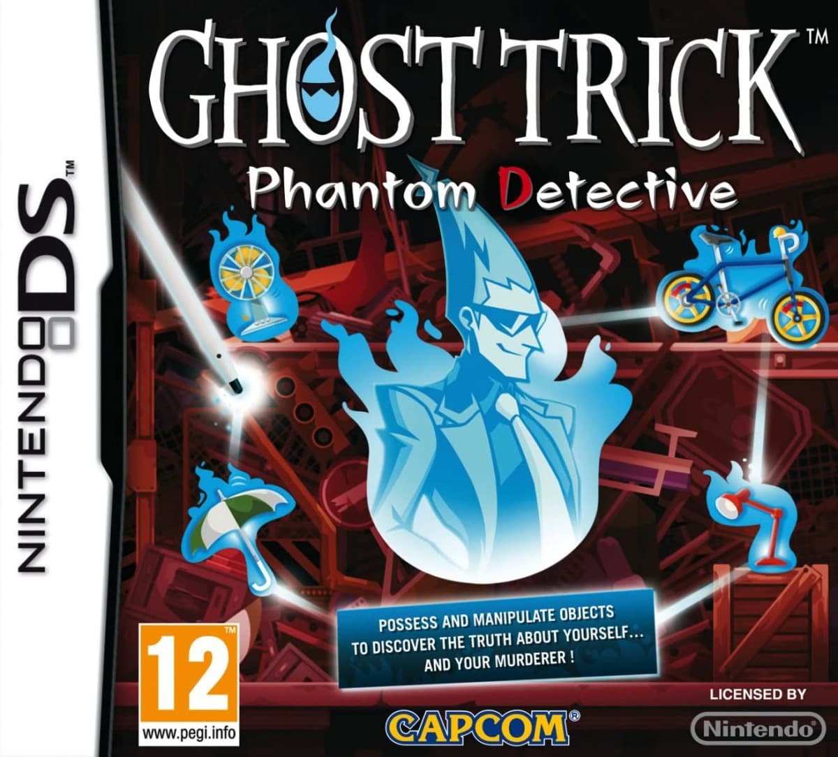
(The EU version positioned it as being in the milieu of Layton or whatever, which not only wasn’t especially accurate but also just doesn’t look great:)
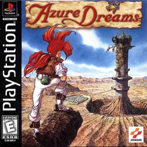
@Tradegood I really need to play Azure Dreams. I love JRPGs and roguelikes, and there aren't a lot of games out there that combine the two, but I adore the Shiren the Wanderer games. This apparently has town building stuff on top of everything else and I feel like I would adore this game.