join us ana
2 Likes
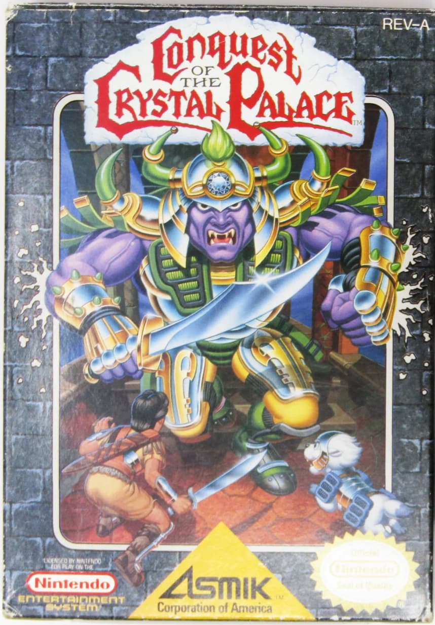
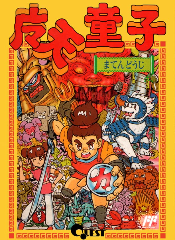
It feels a little bit like punching down doing the “nice anime style artwork vs. homely fantasy novel cover style art” comparison, but here it is anyway - Conquest of the Crystal Palace vs. Maten Douji
4 Likes
For the first time itt, I prefer the NA version
1 Like
I don’t know if I prefer it but I think they’re pretty equivalent
2 Likes
this forum is public so I have to express nothing but support for the U🇱🇷S🇱🇷A🇱🇷
9 Likes
Yeah the more i look at it the more i prefer the NA suikoden 1 box art.
That one, I think, sucks, but in a way that rules.
3 Likes
Like I feel like whoever designed that cover has definitely dropped acid and listened to In The Court of the Crimson King at least once
6 Likes
Big airbrushed wizard on the side of a van vibes
6 Likes
I see Kyle MacLachlan in the top right and Dan Aykroyd middle left.
3 Likes
Jeffrey Wright top left.
2 Likes
Skeleton bottom right
6 Likes
Discovered by the lone rant discussion in the Contrarian thread about representational adaptation vs. interpretive adaptation, I came upon a surprisingly strong inverse example: North American box art of a Japanese developed game, admittedly a licensed game of a North American media property:
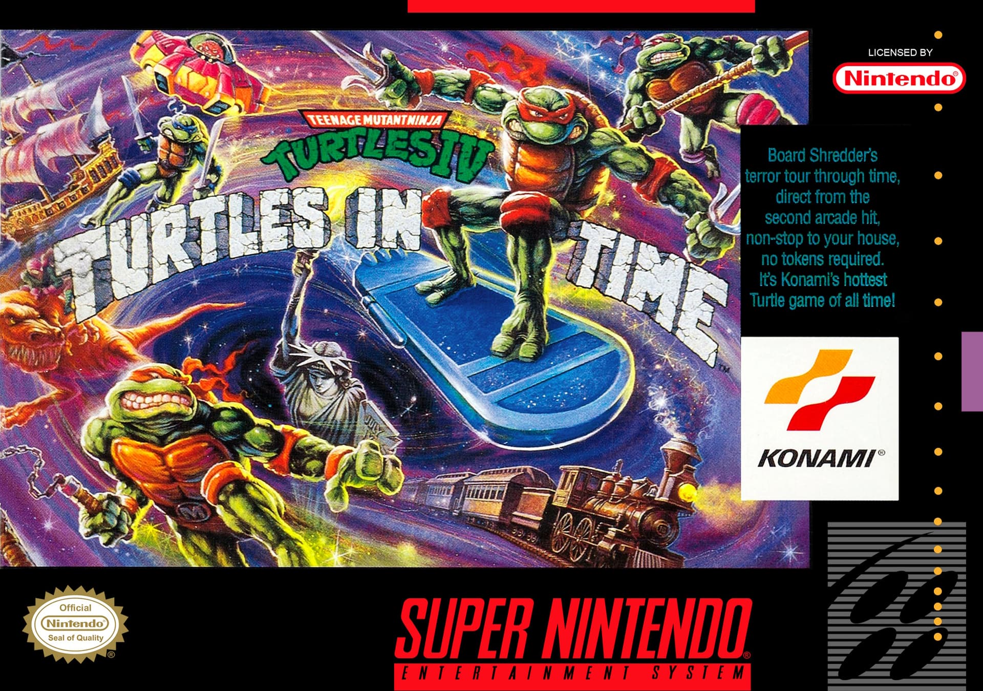
Arguably one of the raddest, baddest, meanest and leanest box arts of that time period, and such an exciting and dynamic scene! Versus the Japanese box art:
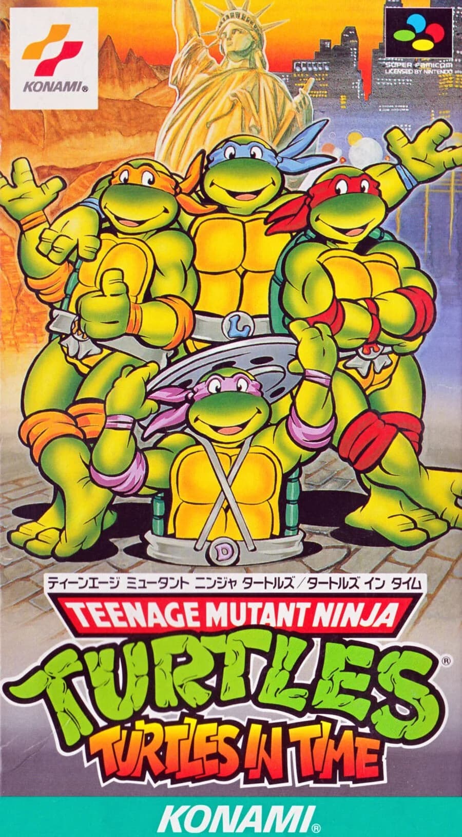
An anodyne, totally boring scene with nothing happening besides the dorky little turtles. Weirdly, perhaps more representative of the art style in the actual game, though definitely still more like the saturday morning cartoon adaptation.
Teenage Mutant Ninja Turtles are probably overall a pretty interesting media property to talk about with regards to adaptation and iteration, since they have been depicted in so many different and quite disparate styles. Arguably this anodyne style on the Japanese box art for Turtles in Time is less representative of at least the original comic book than the North American box art, notable for having a bit of satiric edge compared to what closely followed.
5 Likes
That cover (US) makes me wonder if the artist was actually into the original comics, or maybe used them as reference at least. Feels much closer to those in spirit.
2 Likes
It’s often quite good when the 90s Style is kinda intentionally gross, you know what I mean?
2 Likes
Who hasn’t!
2 Likes
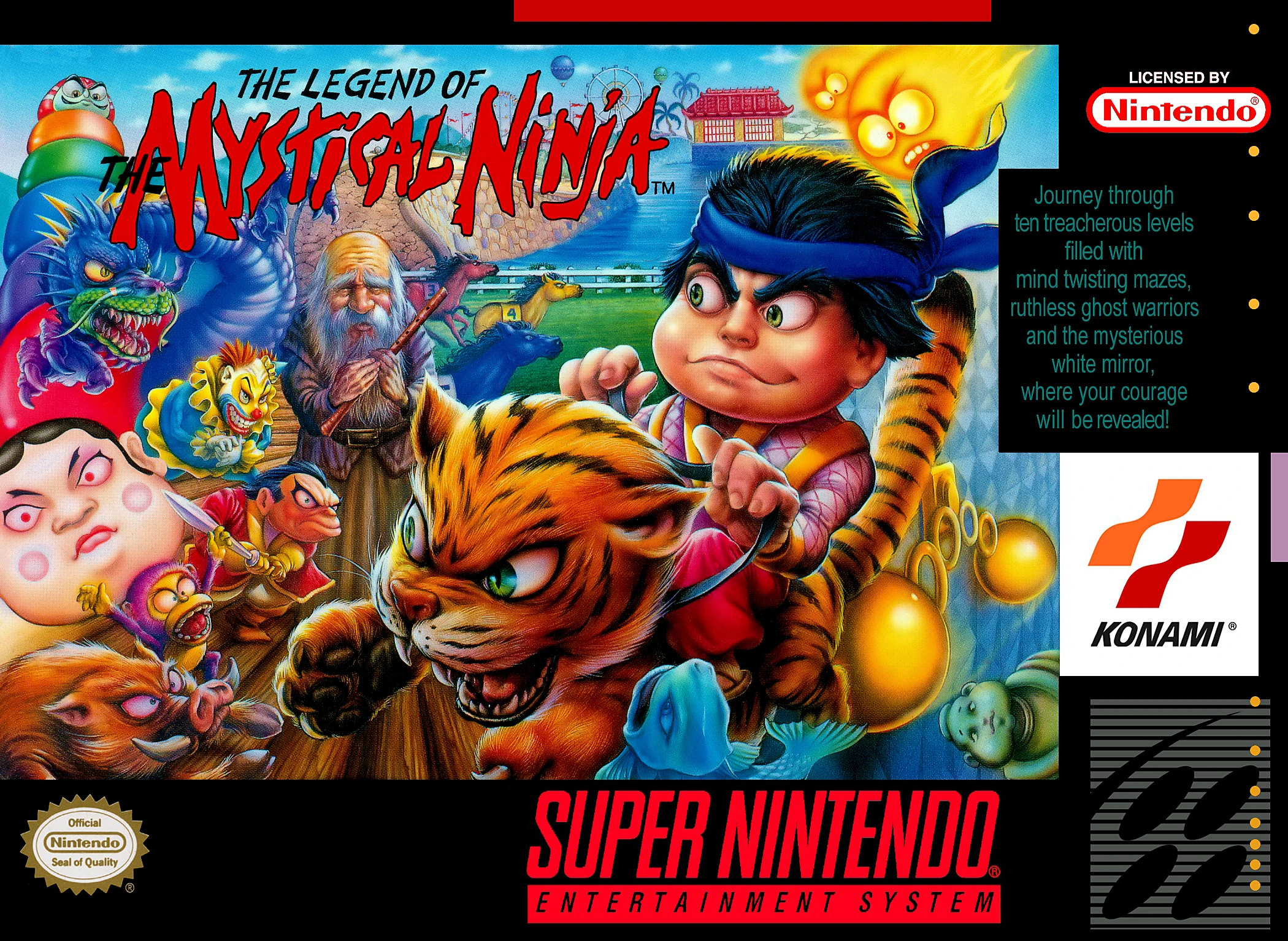
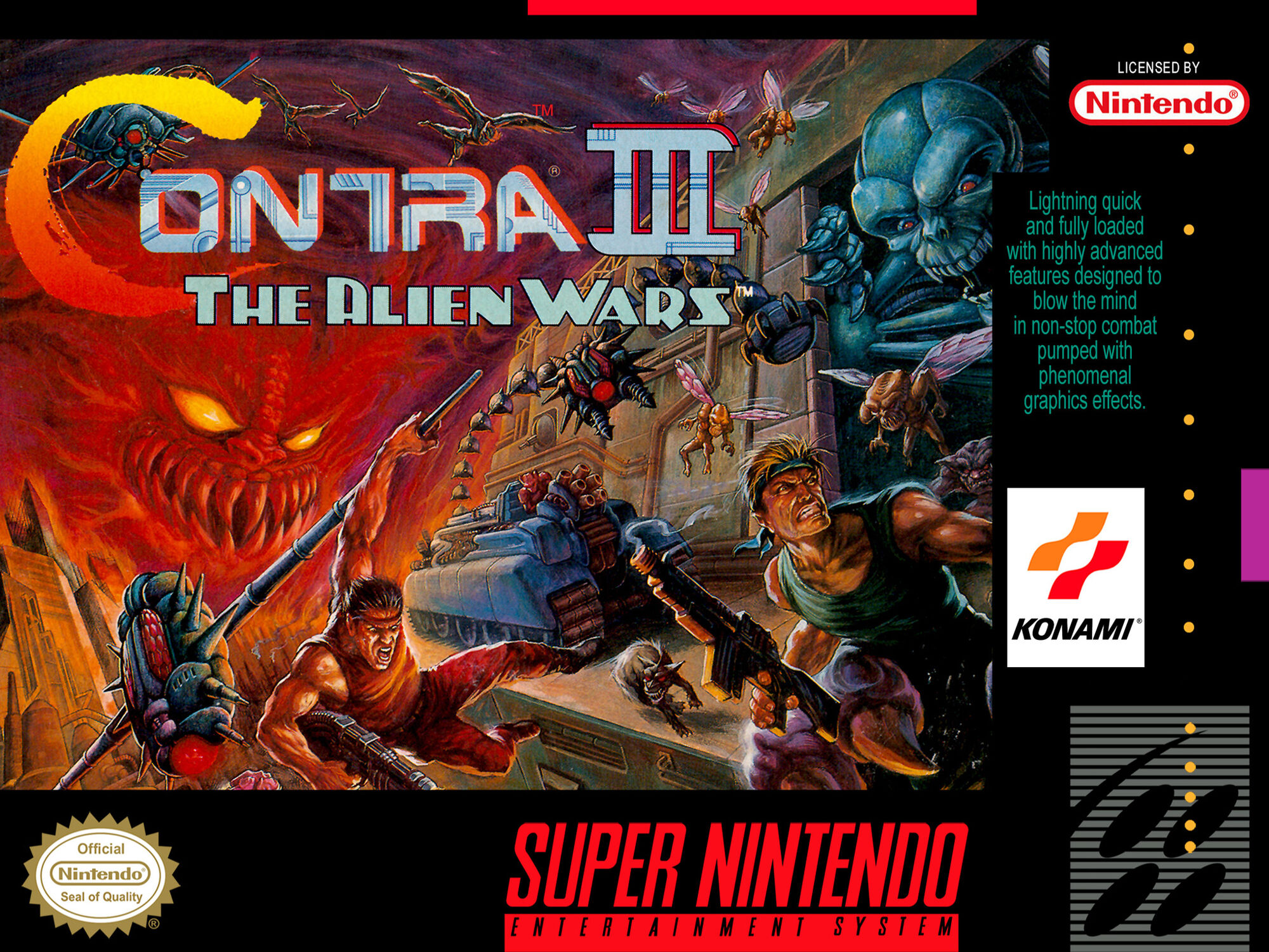
The artist did a bunch of covers for US Konami games I think.
2 Likes
I think so. I love how the bandana colors are red, red, red, and Leonardo.
1 Like