And maybe?
2 Likes
However
How many of these strictly superior to the Japanese box art?
Also just want to say that, goddamn, I absolutely love the Super Nintendo box art template. It’s so easy to make anything look cool on there.
Also quite quaint how many of them have the cheesy, hyperbolic taglines.
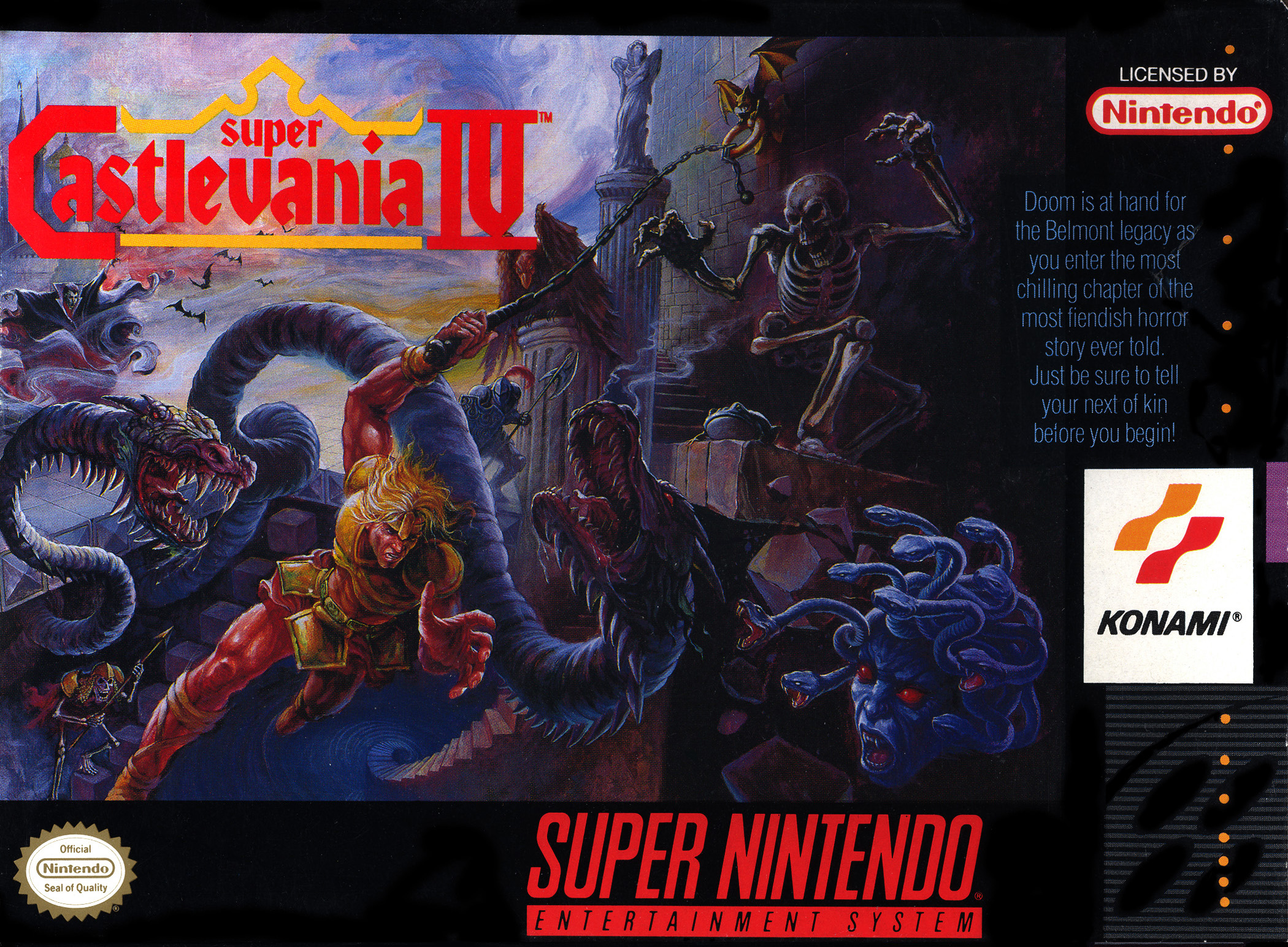
Doom is at hand for the Belmont legacy as you enter the most chilling chapter of the most fiendish horror story ever told. Just be sure to tell your next of kin before you begin!
Absolute straight sizzling hibachi grill hot fire.
2 Likes
My judgements are:
- Contra 3’s NA box art is definitely, easily better.
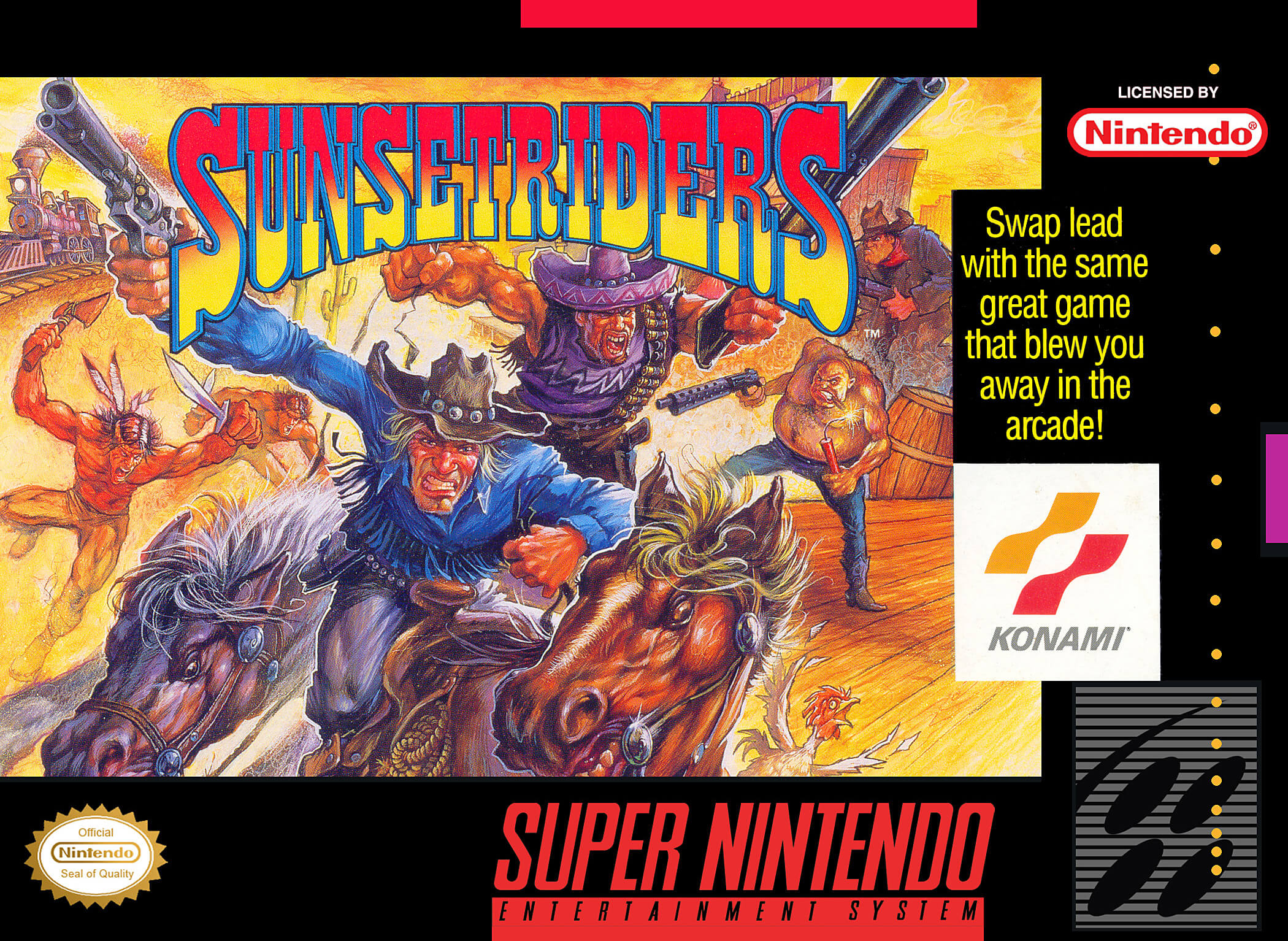
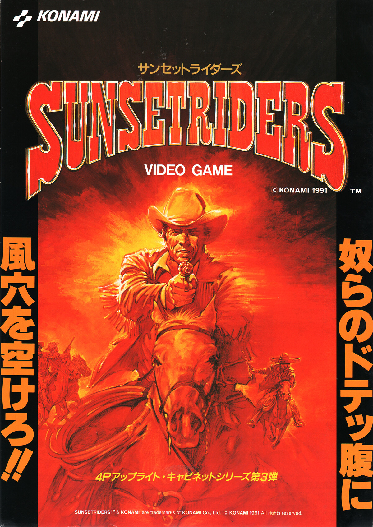
- Sunset Riders is pretty close. The NA box art is a little goofier and more dynamic but the Japanese box art has a pretty powerful aura.
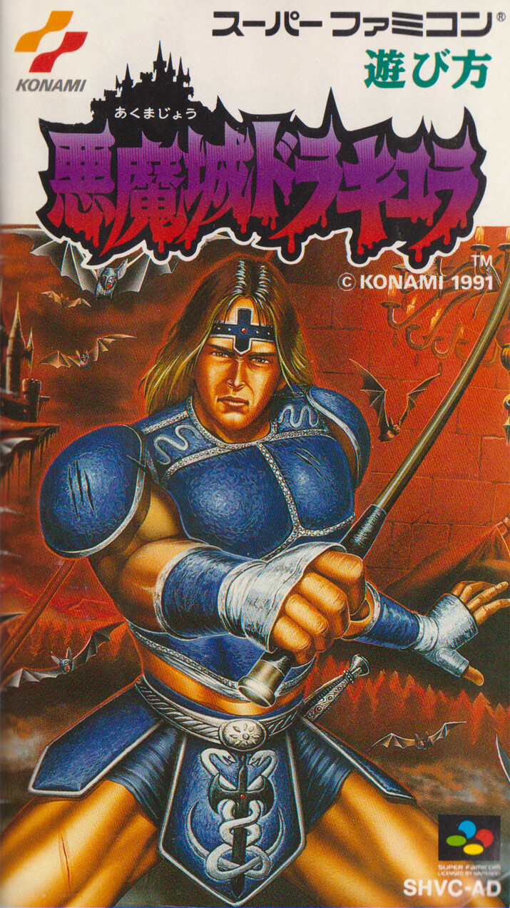
- Castlevania… woof
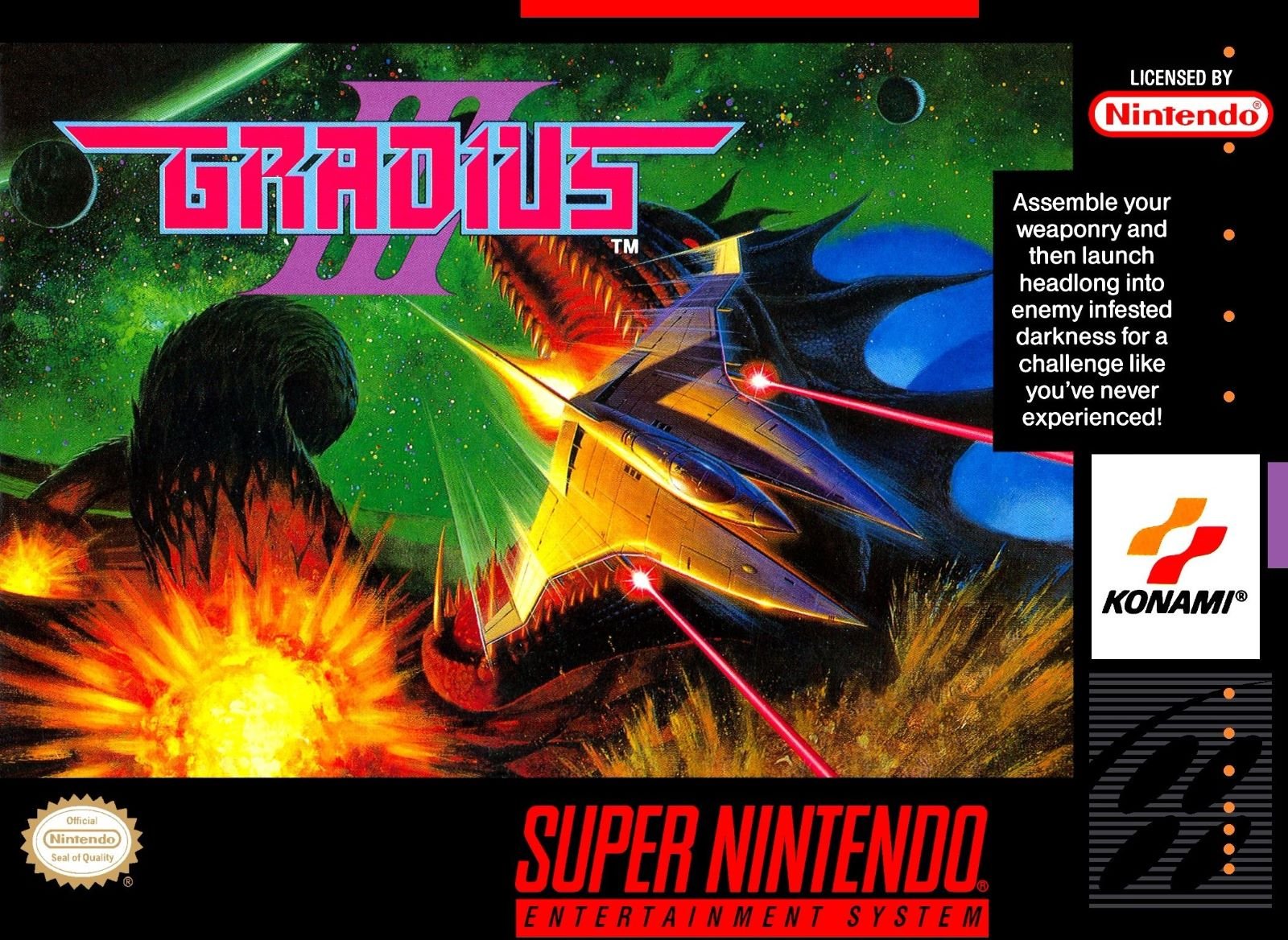
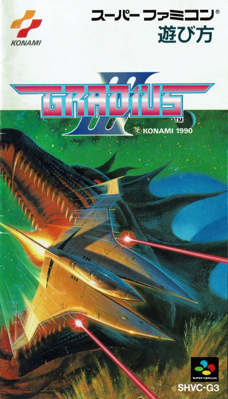
- Looks like the Japanese box art for Gradius III is not the same art but a badly cropped version of it.
Might final fight US is kinda sick though lol
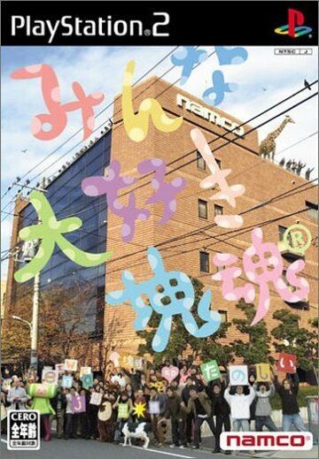
US we love Katamari was
Kind of anti climactic
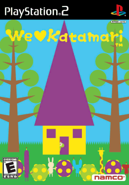
Jp was great
4 Likes
2004 seems way too late for the Japanese box art to be crushing the NA box art so badly. Though I guess I did open this thread with a game from 2002…
1 Like
Yeah and it’s a shame after the first game was basically a 1:1 localization, beautiful!

5 Likes
Black Belt is way more iconic and striking.
2 Likes
Tee hee!
1 Like
Ay.. if you grew up that way… sure.. not for me to argue.
1 Like
Wow the Japanese one makes it actually look fun
2 Likes
I’m not gonna edit the title but this thread can kinda be for “box art where there’s a weird gap in quality between locales” cause I got another one where, well, I don’t even like the North American box art that much, I definitely didn’t expect what the Japanese box art would be like.
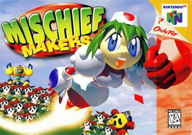
North American Box Art for Kirby Super Star
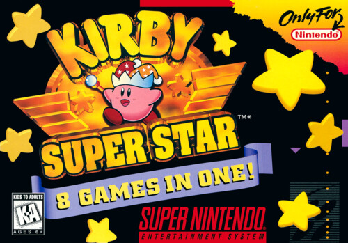
It’s loud, but still also kinda boring. Not much to look at. Unclear why they picked Beam as the power for Kirby to have on the cover. There’s way too much yellow. However, the contast between the black and the stars is pretty good.
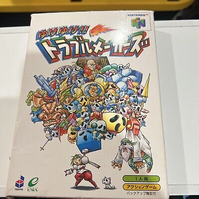
Japanese Box Art for Kirby of the Stars Super Deluxe
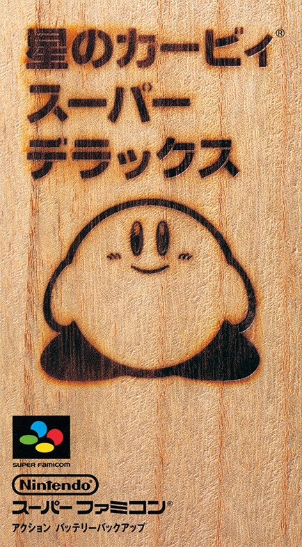
According to wikirby.com, this box art was based on an idea by Itoi Shigesato, and is a parody version of “paulownia wood boxes typically used in Japan to package luxury alcohol and tableware,” and meant to convey “how rich [the game] is in content.” For one, that is weirdly high concept and alcohol adjacent for a cute lil’ game for kids, but more than anything, they missed an opportunity to have a cute little cartoon of Kirby in a dramatic scene, which is what I was expecting to find when I looked up the box art.
Trust me, I get it, but I don’t like it. It’s a dumb gag instead of cool art.
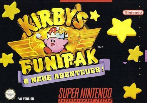
PAL Version Box Art For Kirby’s Fun Pak
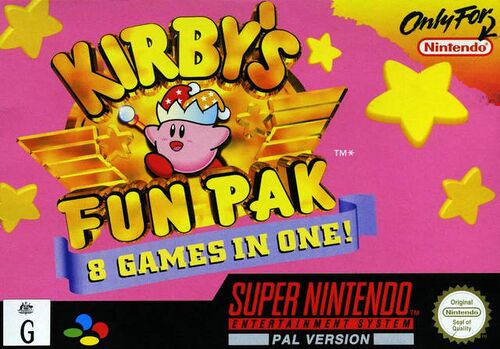
This is almost great, because, wow, that’s a lot of pink, and pink is great. However, it gets two big strikes against it. First, they clearly just swapped the black for pink without thinking about it much, because those stars look awful against that solid pink background. Should have worked on those stars a little more. Secondly, Fun Pak is such a dumb name.
For the record, the German version is basically the PAL version but with a black background instead of pink.
Very disappointing suite of boxes arts for this wonderful game!
1 Like
As someone who encountered this in childhood, I think the japanese box art was very off putting. Probably I was not the target market. The PAL box art is lovely, but if you’ve ever encountered a pal gamer of 90s vintage, their expectations of how fast a game should be are frankly insane. I don’t know how they ever played Sonic.
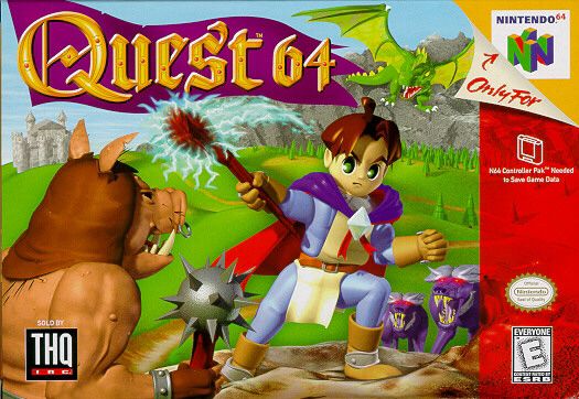
For the n64 rendered box arts, you just had to be there.
You just had to be six years old, man. That shit ruled.
It’s still anime with those big ass huge ass eyeballs. And the hoards of guys.
I used to have a Japanese copy. One of those games that had a whole color manga in the manual!
4 Likes
Missed the no Phalanx rule at the top lol.
1 Like