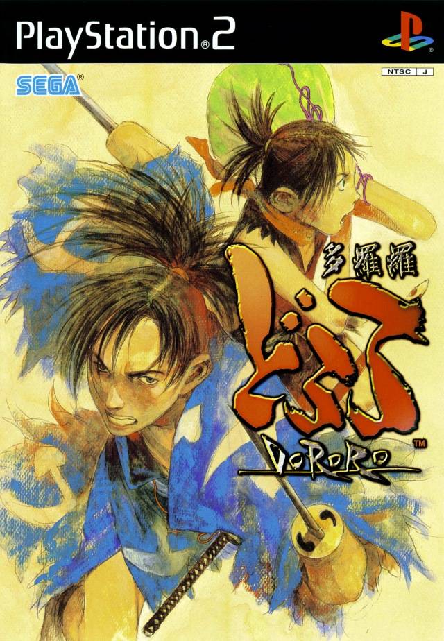
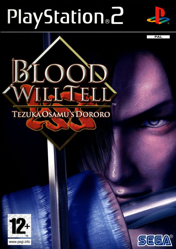
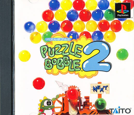
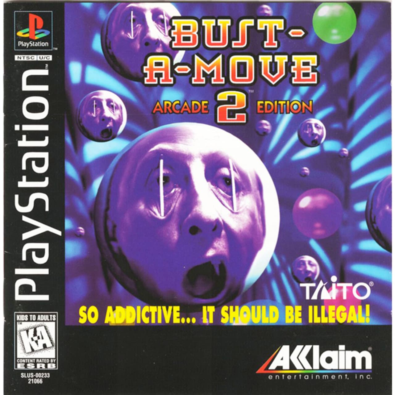
This probably has been posted already but this one gets me so steamed to this day. It was in the middle of the era where every serious game for big boys had this box art. It was a disappointment all on its own but losing that great japanese box art really rubbed it in.
4 Likes
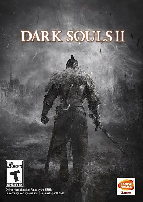
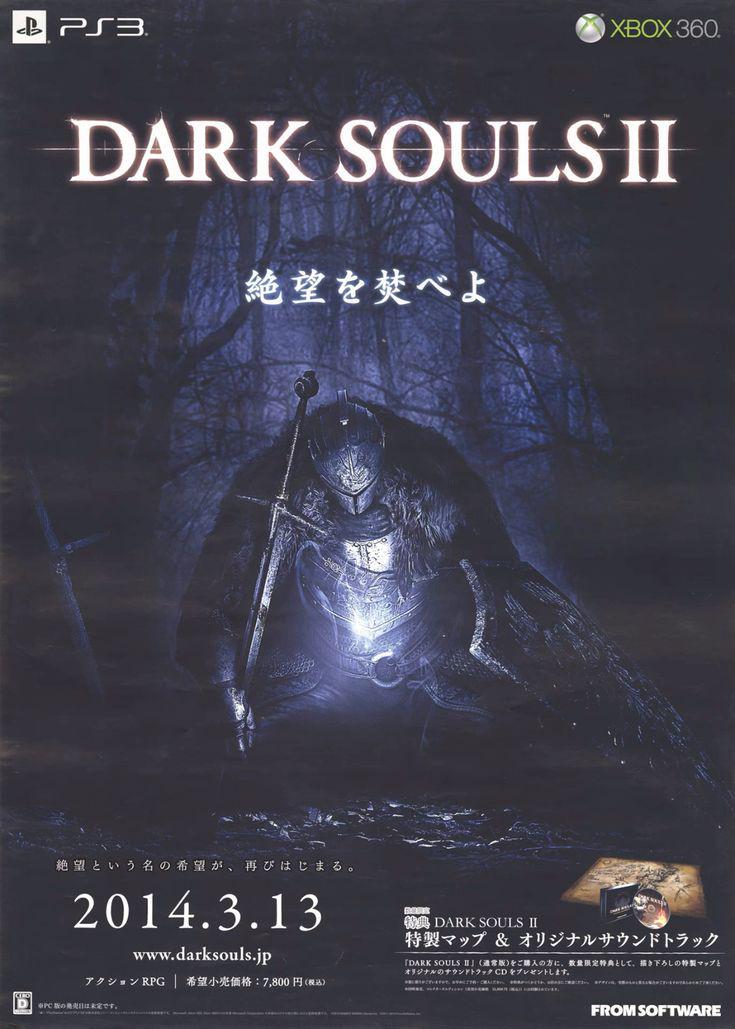
In my imo both of these have their place in time, but I can certainly say which one I prefer.
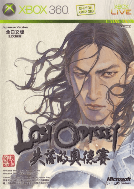
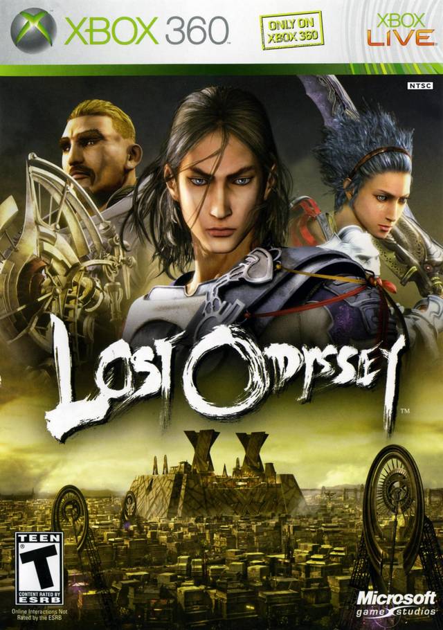
Then there’s lost odyssey, where not only did we do the illustrative to cg treatment, we also lost the rice paper which I believe to be part of the cover experience.
(to be clear I don’t dislike any of these covers but they are quite different)
7 Likes
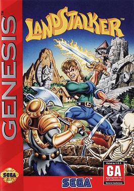
I bought Landstalker because the back of the box looked great, not so much the front lol.
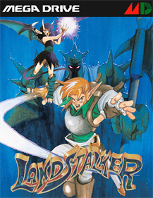
Even if the American one had the same font it would look better.
3 Likes
This thread title cracks me up every time I see it
2 Likes
Part of the insert credit culture is avoiding using curse words so when someone breaks and uses one it can be pretty funny.
2 Likes

1 Like