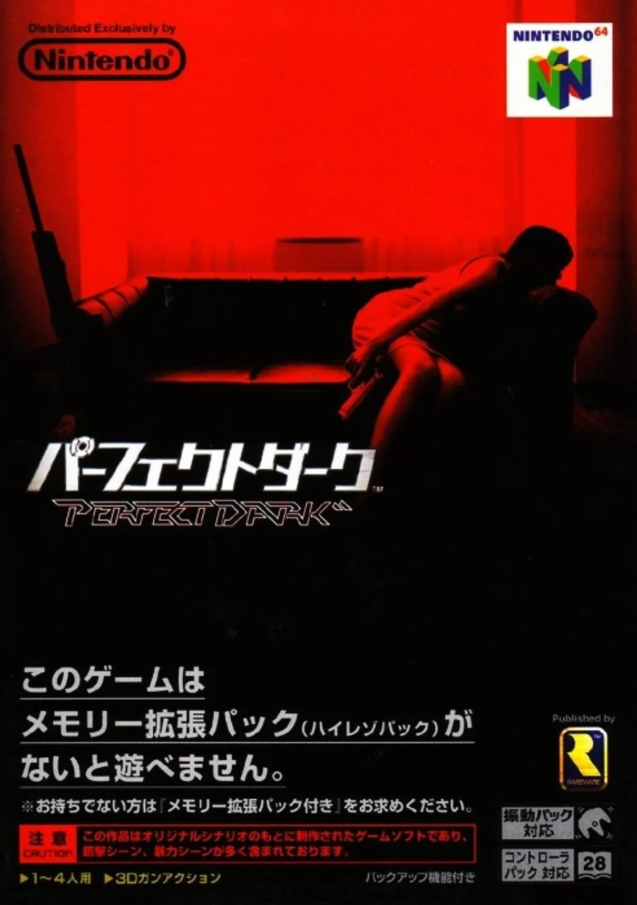
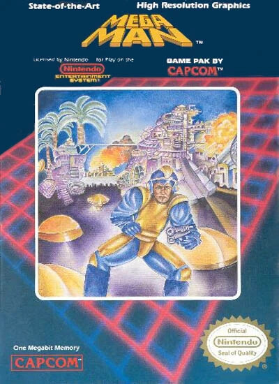
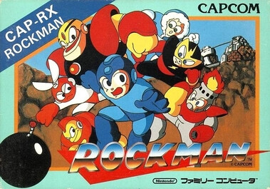
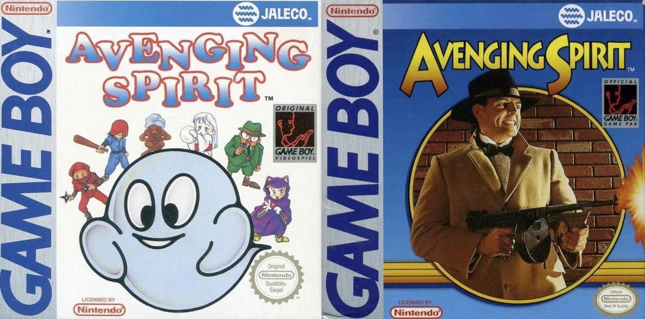
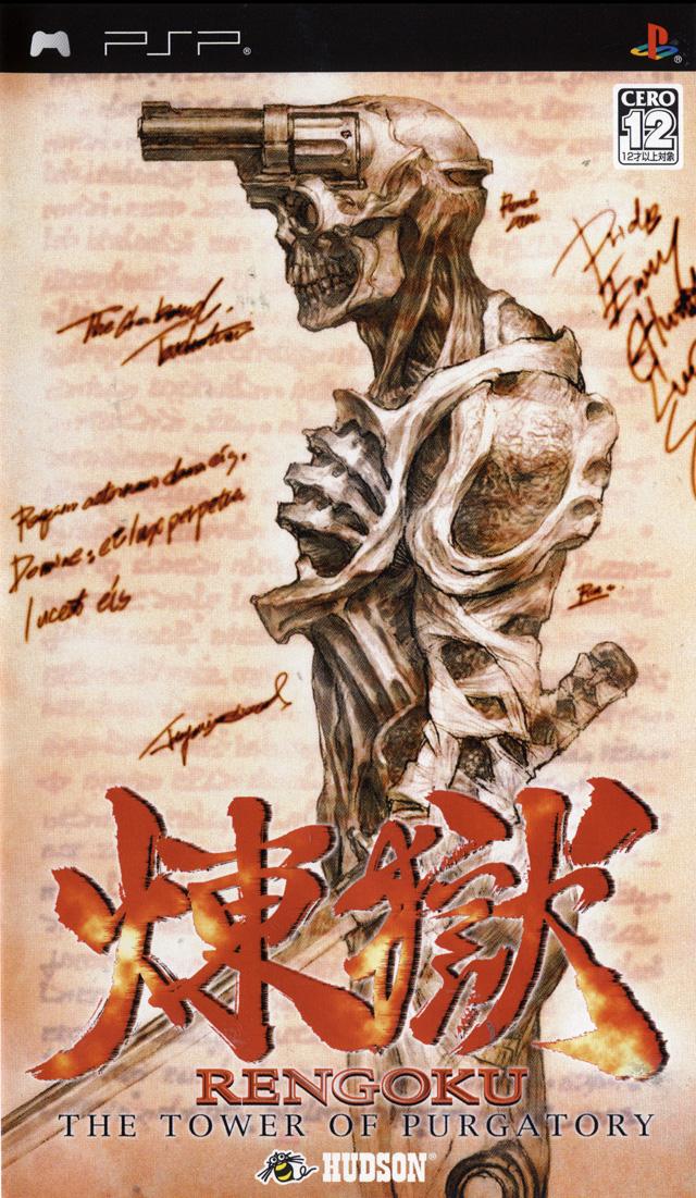
Post box art for the same game that is vastly different between regions.
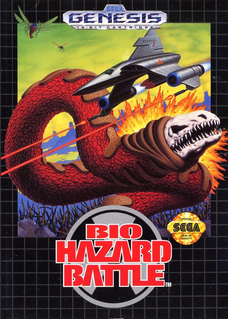
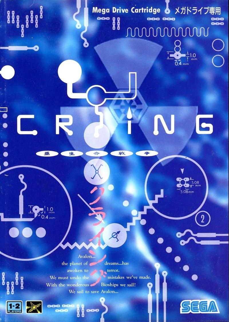
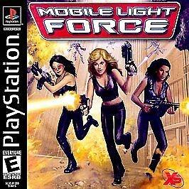
Bio Hazard Battle / Crying
it’s a different version (not region) but I like how much the team’s visual direction changed for the remaster
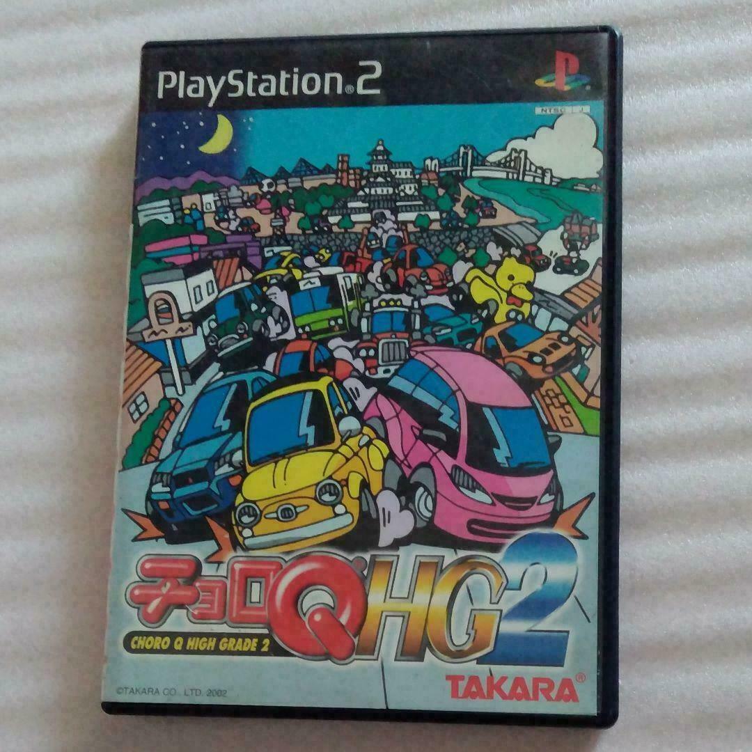
Choro Q HG 2
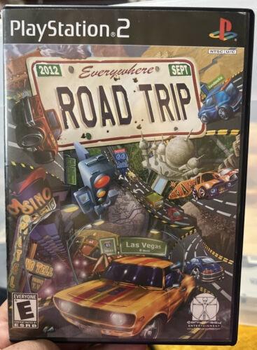
Road Trip
I find these interesting because they’re conceptually sorta similar but art style, featured vehicles, and tone are all so different!
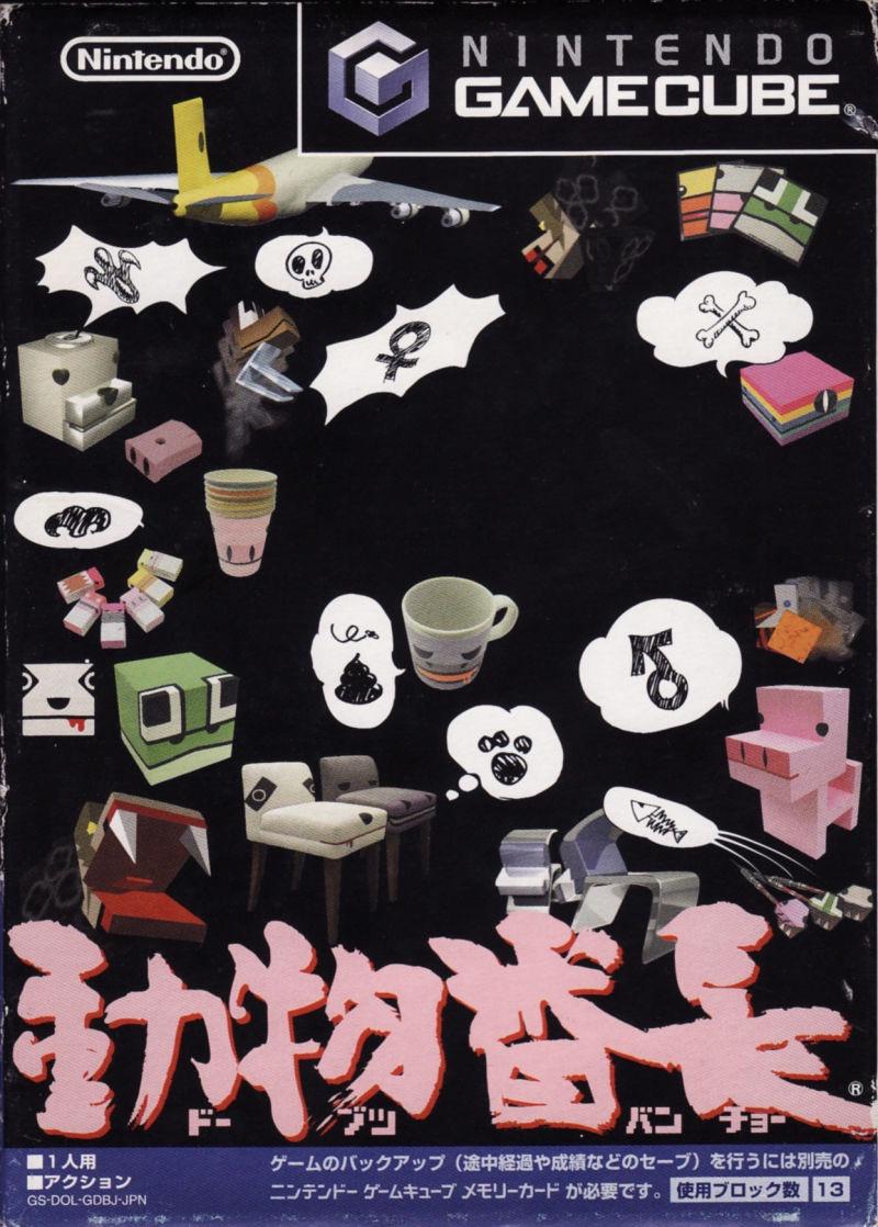
are the Japanese box arts wildly better every single time or am i just biased
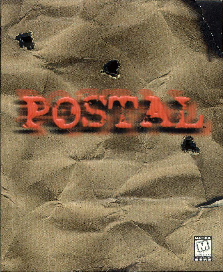
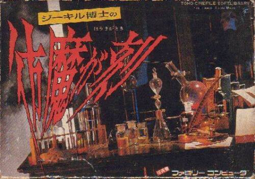
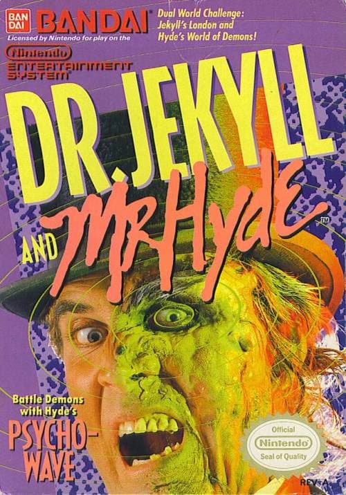
This is another comparison I think people have generally seen before, but I was just recently made aware of it and it did make me lol
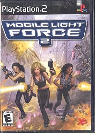
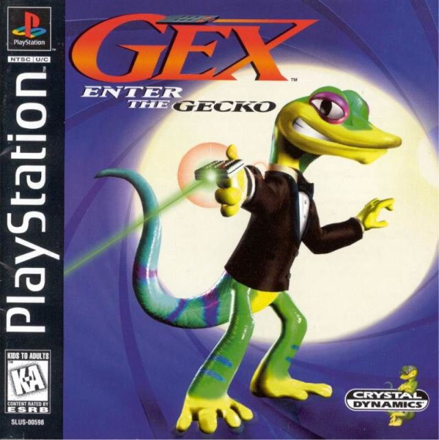
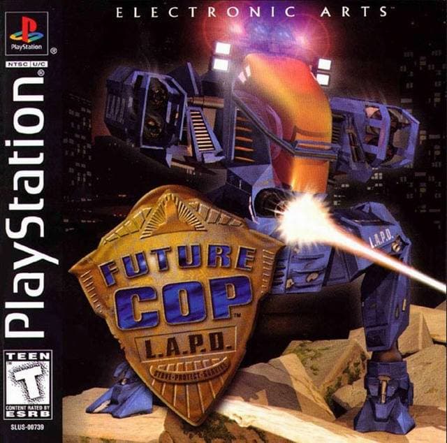
Two of my faves, and at least the 2002 US video game scene was weird enough at the time that these both could get Western releases at all!
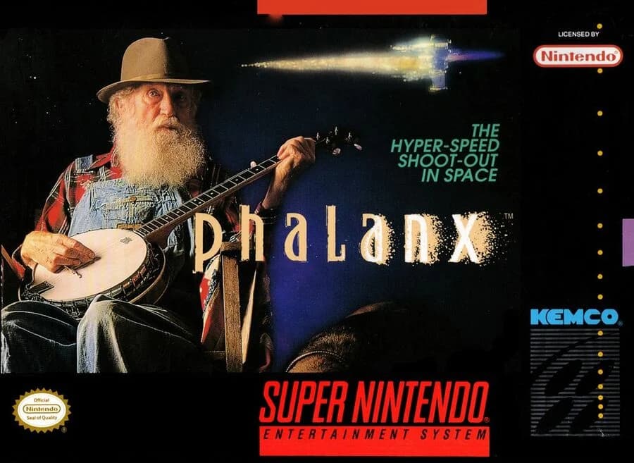
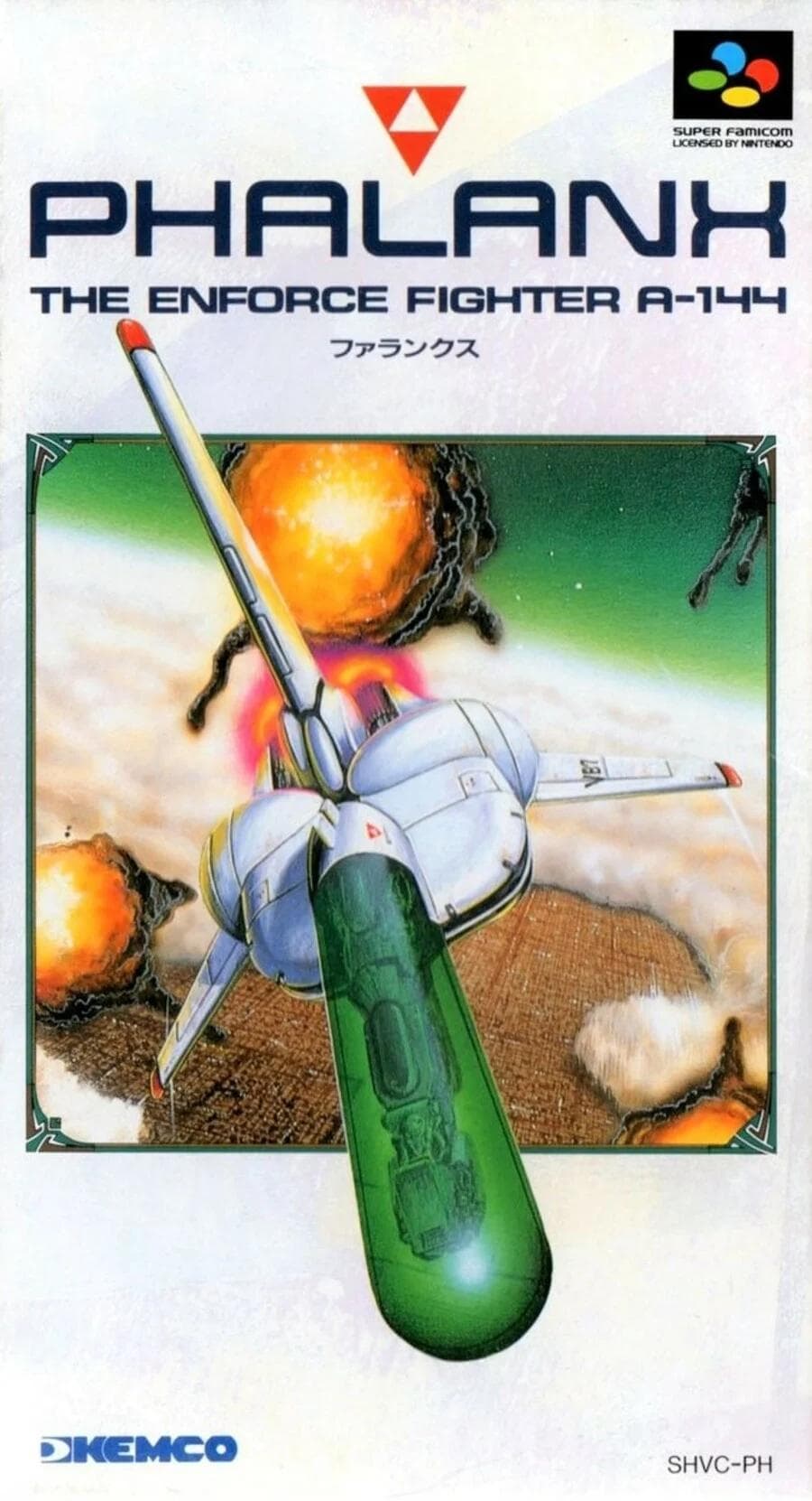
@KingTubb man, that SNES Phalanx box art is hot! Feels like no one re-captured the visceral power of “banjo in space” until Outer Wilds.
The crazy thing about the Future Cop L.A.P.D differences, is that it's more than just the covers.
They changed the Japanese version in-game too.
I can't find a write-up online, but if my memory serves
the in-game character model is slightly more anime colored and has a shiny cockpit.
they added drawn character profiles when people are talking on the radio to you.
they changed the cutscenes with the dispatch lady.
I'm not 100% certain on the above.
I might be slightly misremembering, but there were definitely differences beyond the covers.
@KingTubb well played
also can we please include you in this Violence Island conversation?
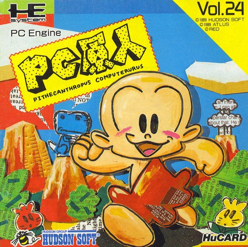
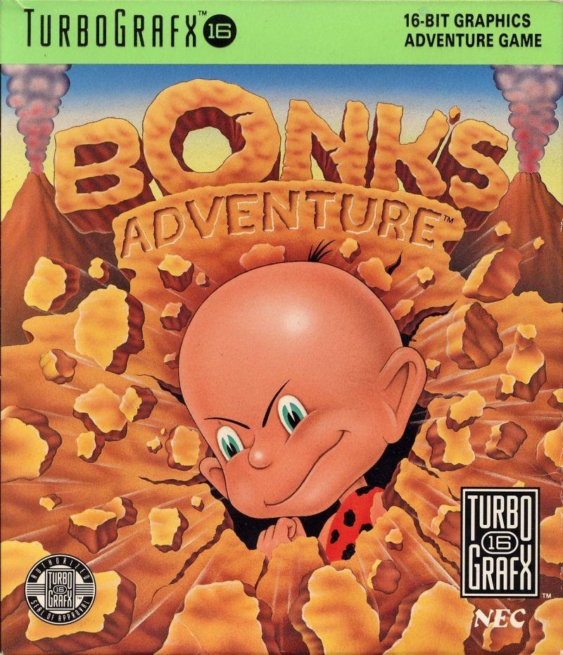
@hellomrkearns this is my first time learning about PC Genjin… that's brilliant