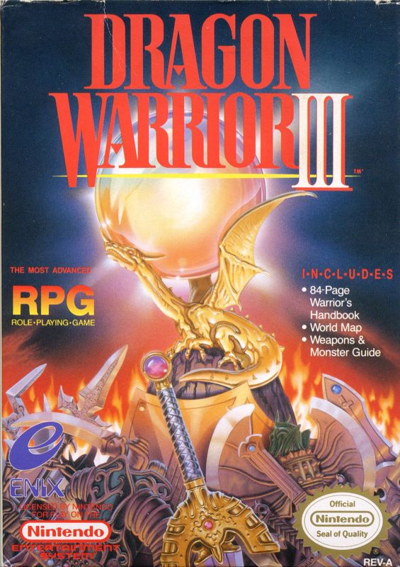
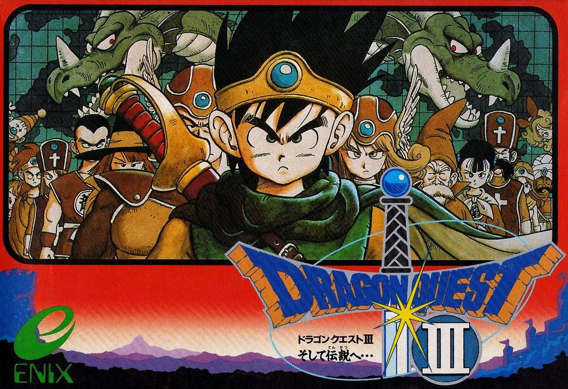
Even time I click on this thread I get actively annoyed that we got the worst box art in a lot of cases. If I ever decided to get a high resolution printer, printing out the nice box art would factor into the decision.
I love when games come with reversible box art. The Nier remaster has great secondary box art even if the game itself isn’t the best version
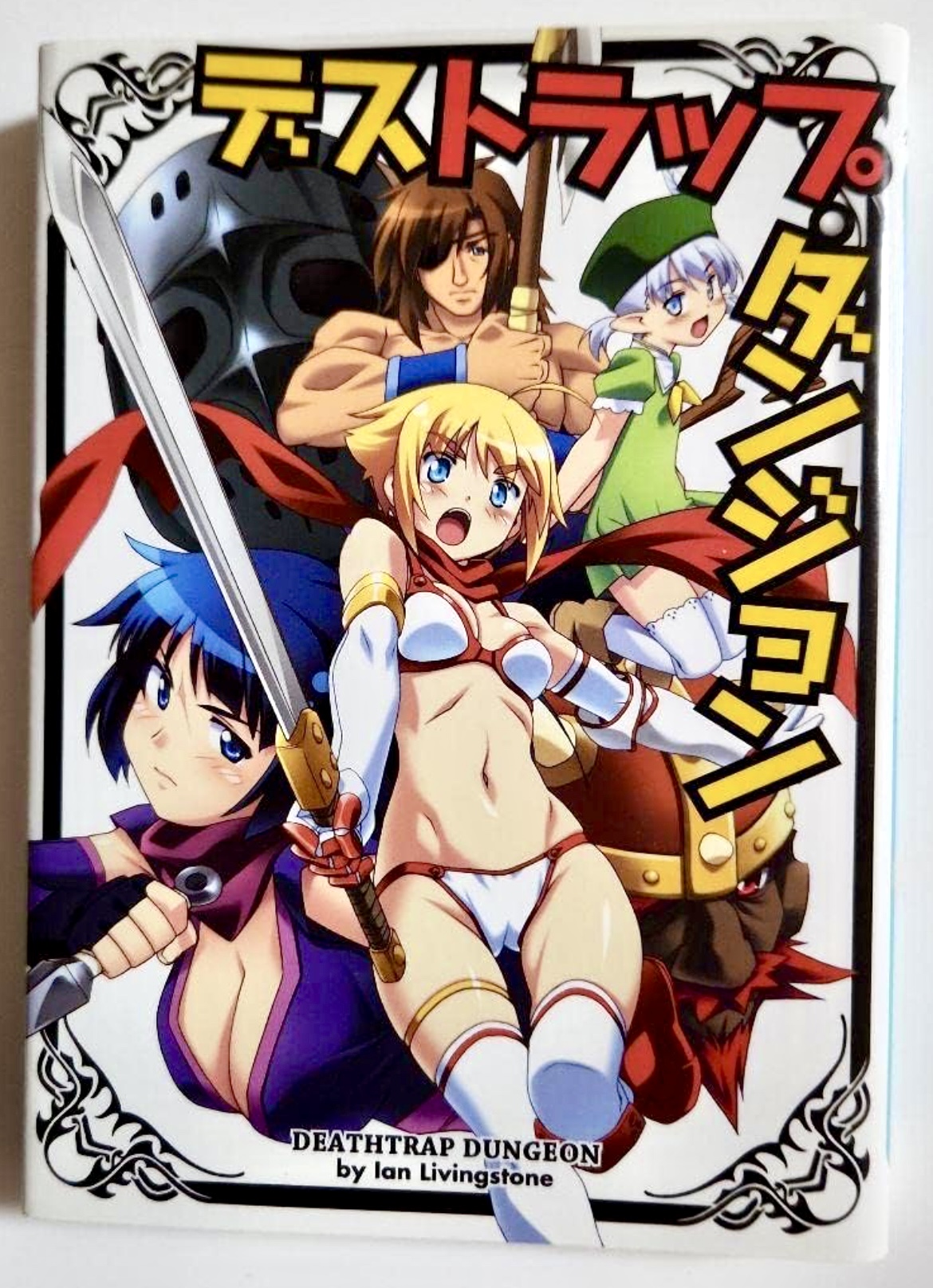
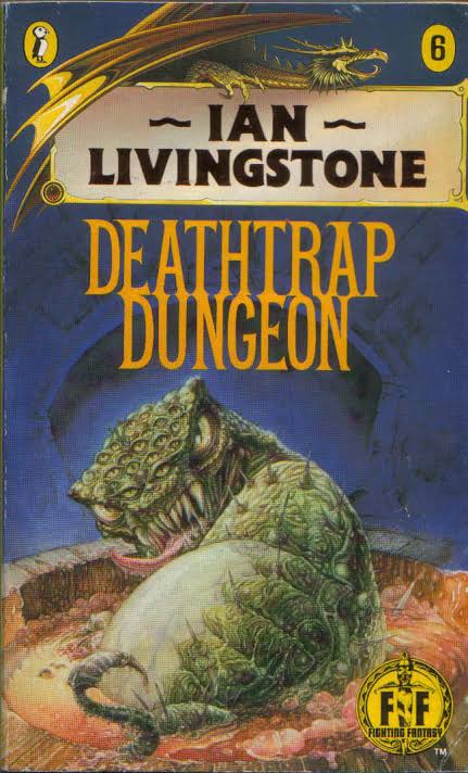
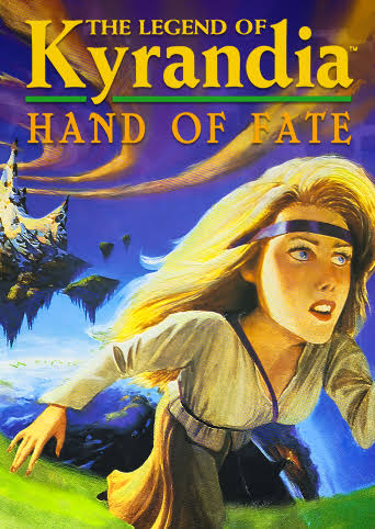
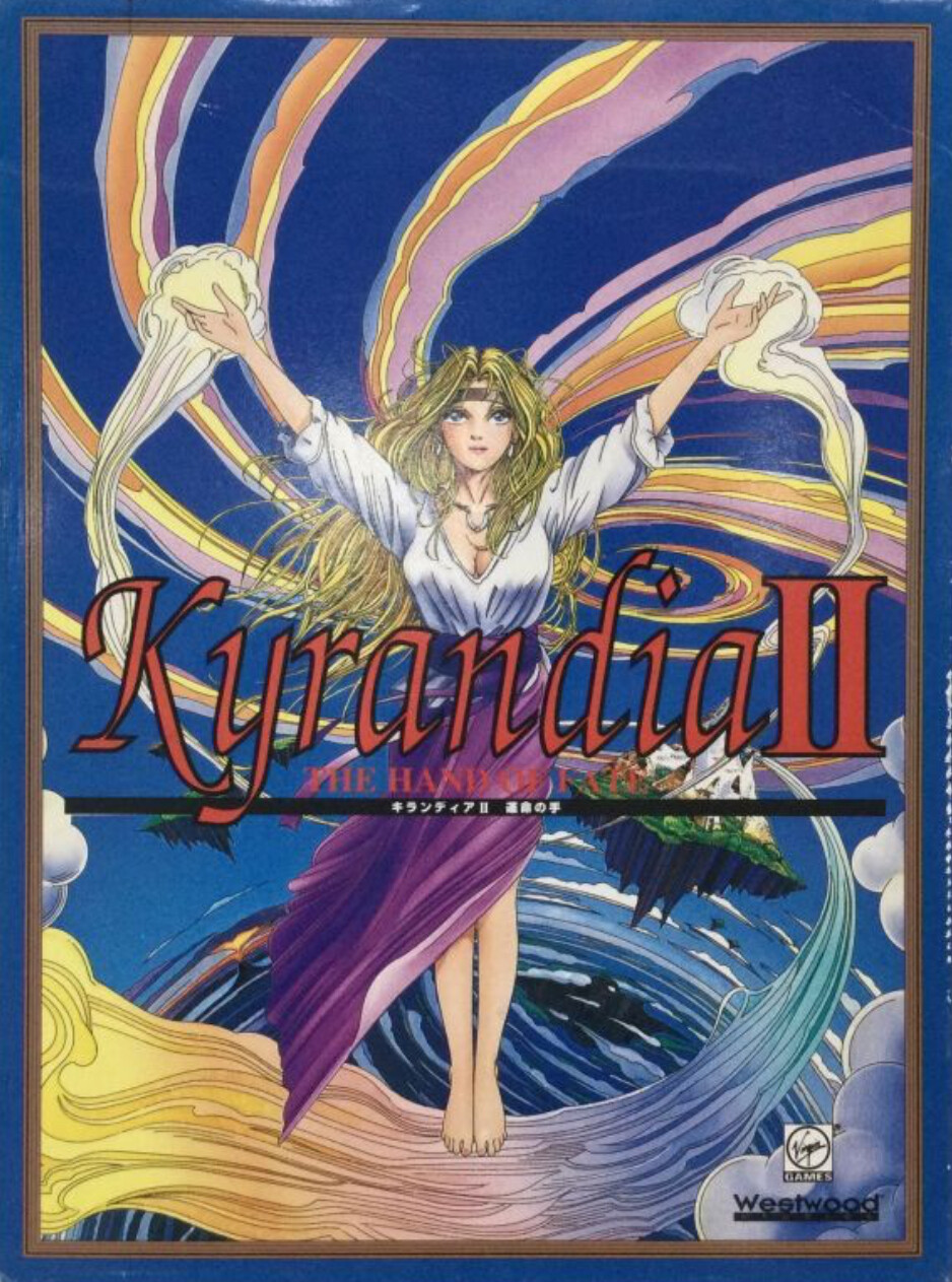
Not wildly different, but amusing how the original cover and the Japanese computer adaptation have understood the same “show the heroine running away from a flying island with spiraling clouds and add some fisheye camera effect.” assignment with two very distinct interpretations.
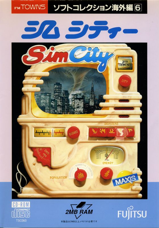
Today I’ll focus on the original SimCity (Mobygames). The basic box art featured what looks like a very stylized TV set. The US version is similar; for fun, I’ll show the FM Towns one, which adds a frame around it.
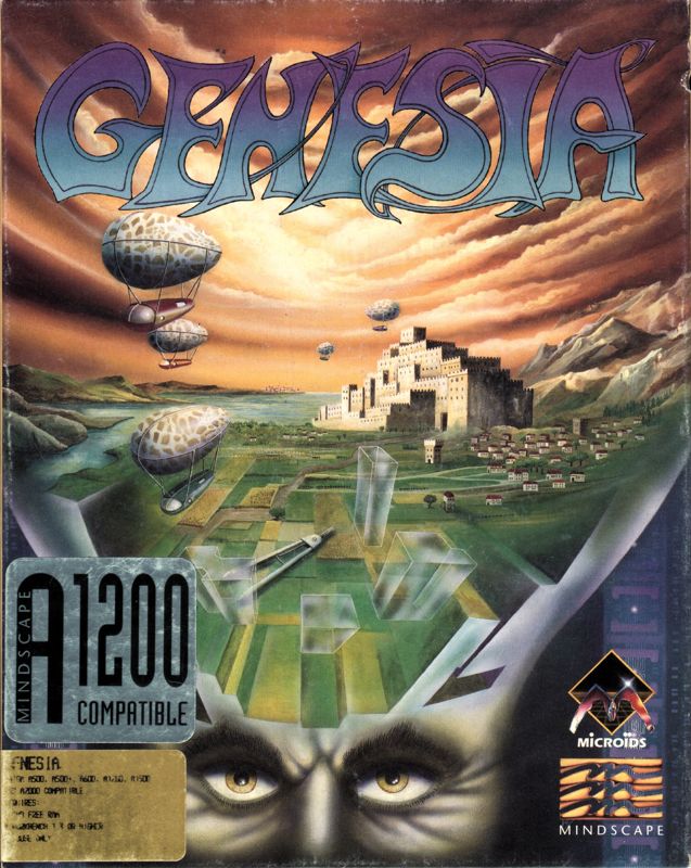
The European version (Genesia) is this pseudo-futuristic fantasy that is all in someone’s head. (The longer I look at the outline to the head, the more unnerving it is.)
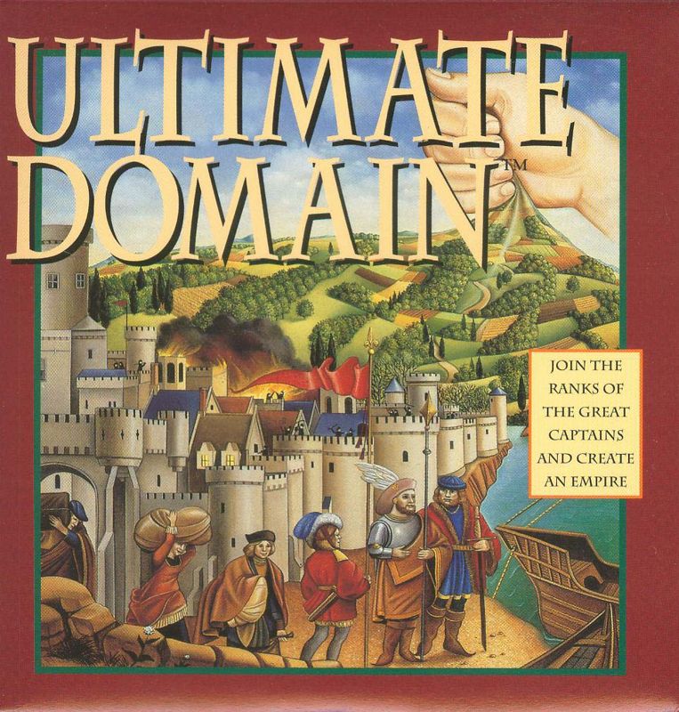
The North American version goes for a very Eurogame (Settlers of Catan, Puerto Rico) sort of aesthetic: late medieval Europeans outside a castle they’re too big for, near a ship. The fist in the background pulling the land upward maintains a hint of the original cover’s sense of fantasy.
In both, the nod to the genre is the most obvious unrealistic element about it. Genesia says that strategy is in the player’s head, unfolding across a vast imaginiative landscape. Ultimate Domain says that strategy is in the player’s hand, to pull the land up like fabric to make it ours.
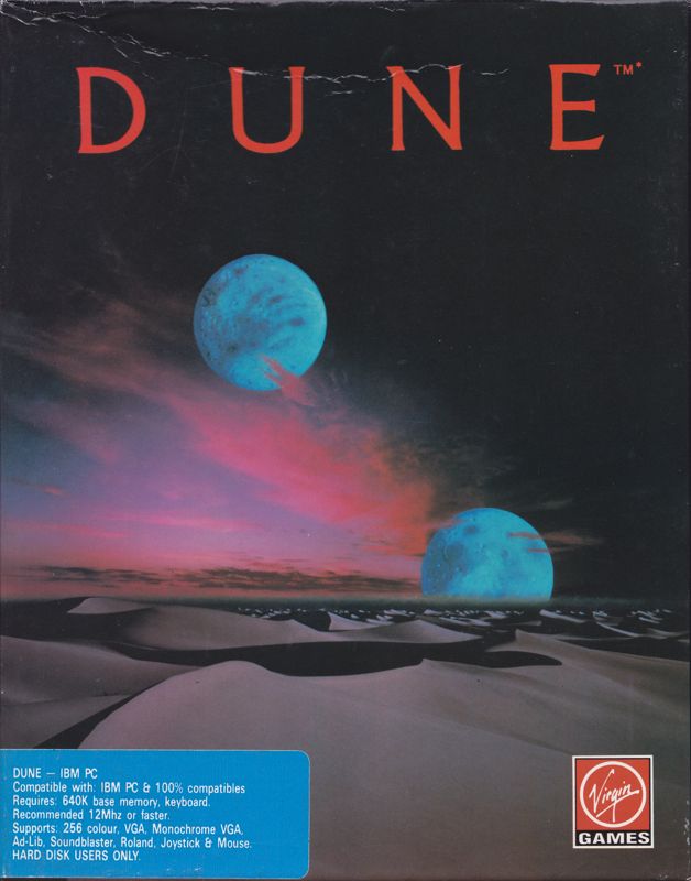
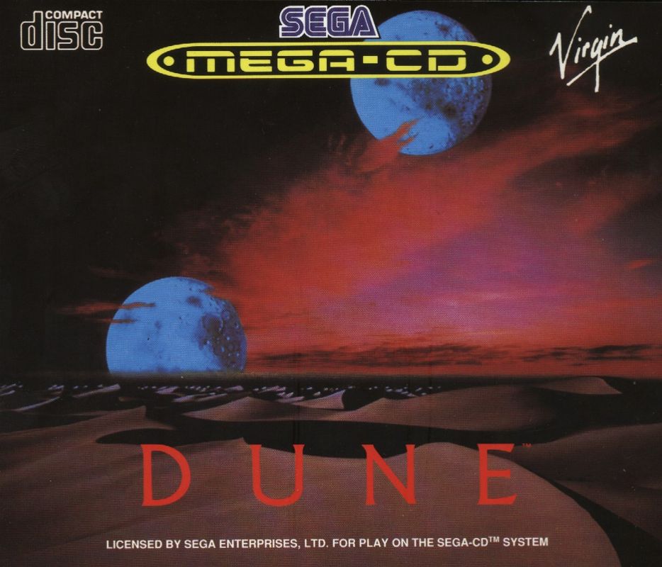
The UK DOS version eschews people and lengthy titles entirely for a duned landscape with two moons. The Mega CD version is similar but rearranges the lettering and mirrors the image.