Not that wildly different since they’re thematically similar but…
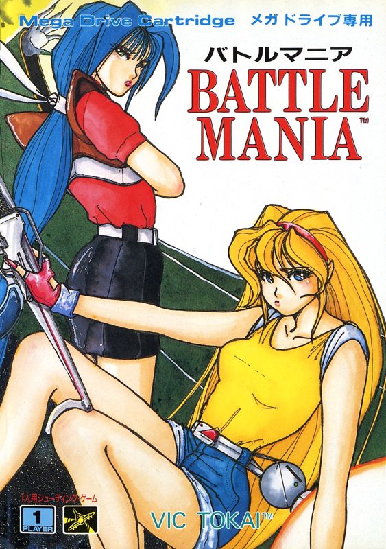
Battle Mania
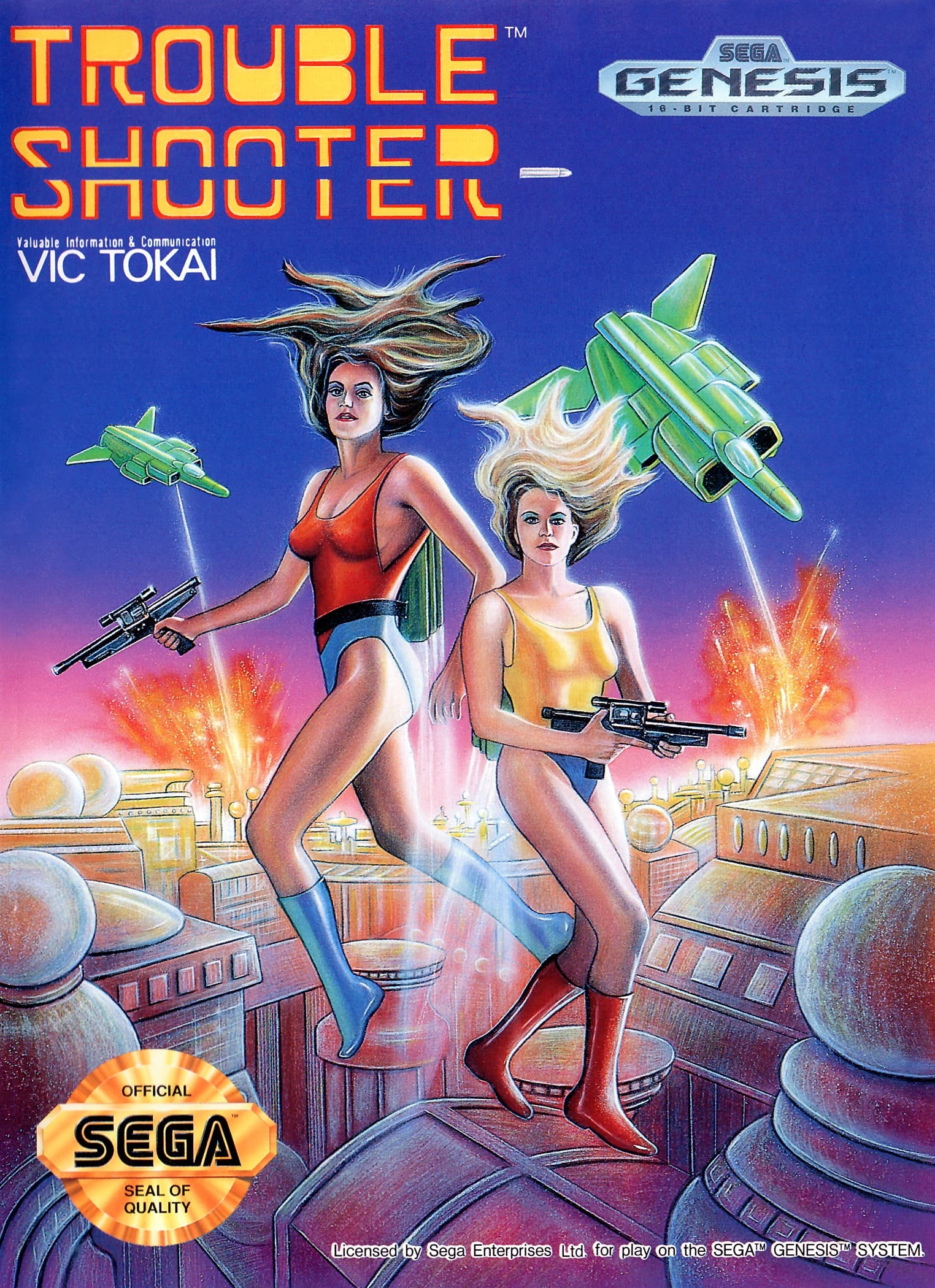
Tricky Shooter
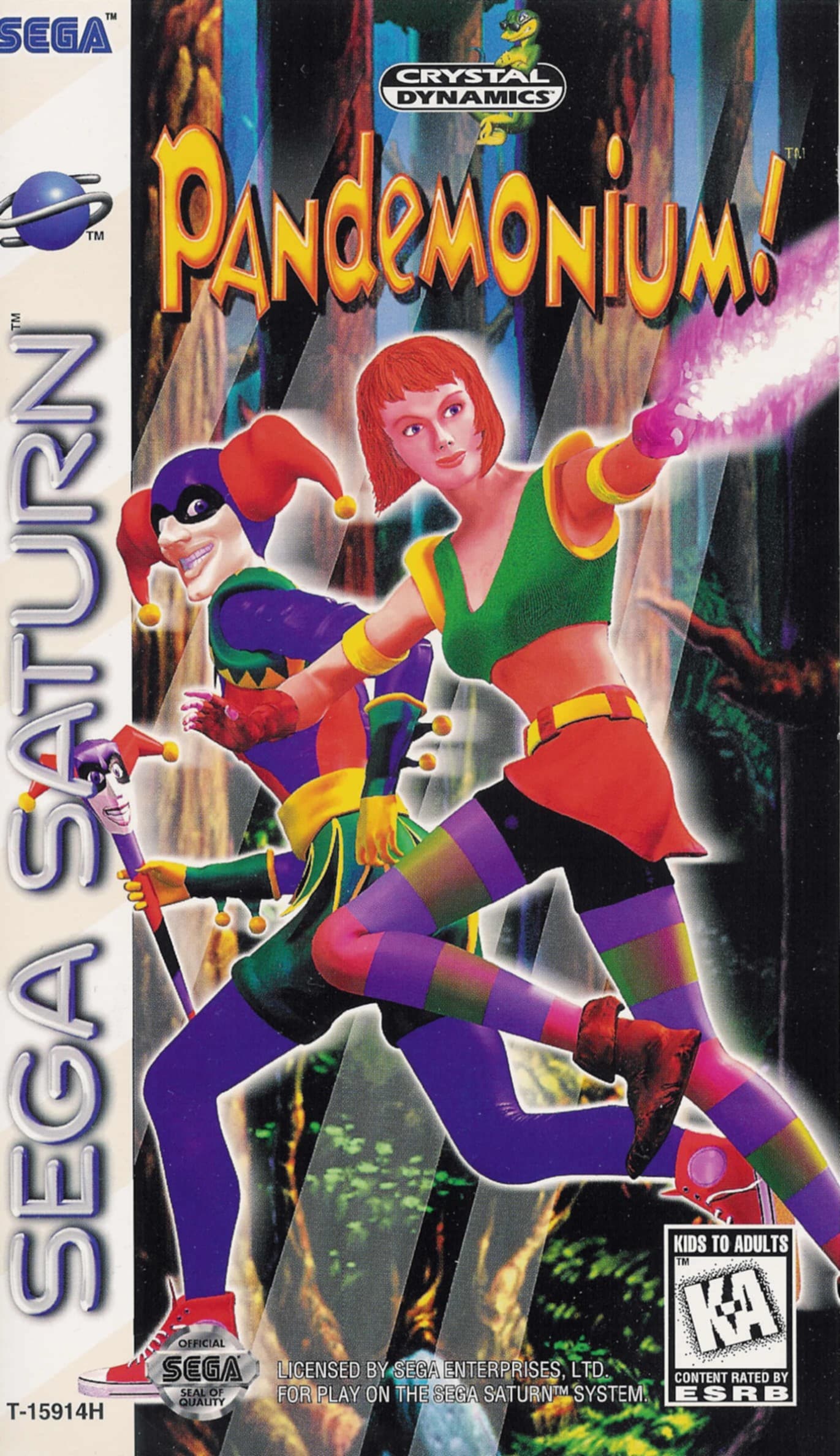
Pandemonium!
Magical Hoppers
Not that wildly different since they’re thematically similar but…
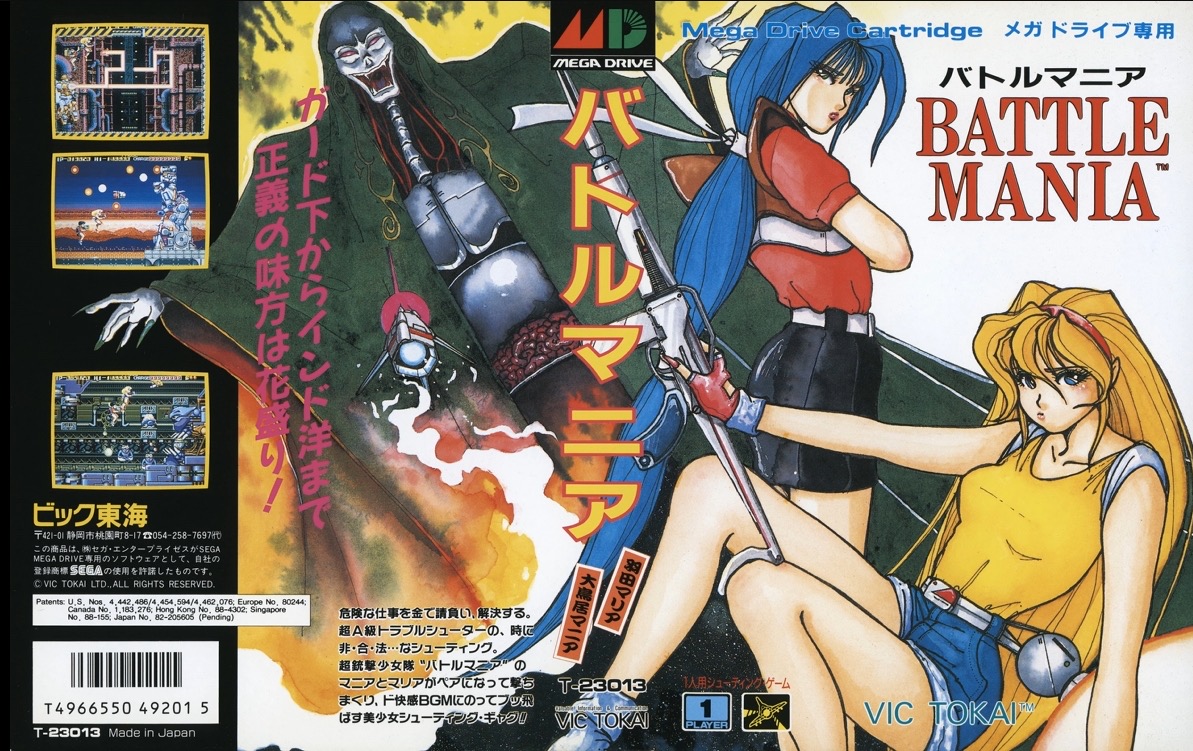
Battle Mania
Tricky Shooter
Pandemonium!
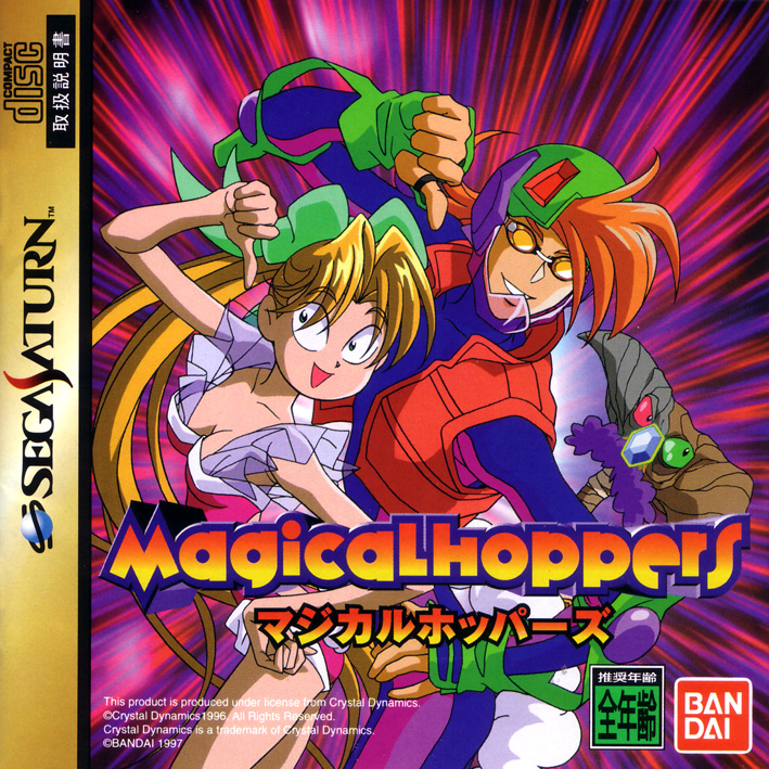
Magical Hoppers
Battle Mania
I love that they both pout. The full art continues on the spine and back cover.
Magical Hoppers
Banging new character design from Suezen of Shining Force II fame.
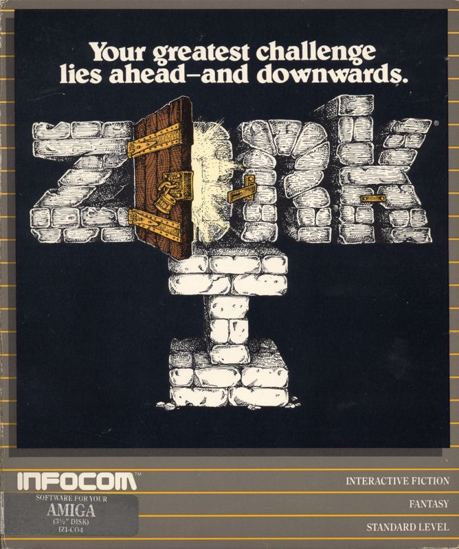
Zork!
As a kid, I had a box with this cover design:
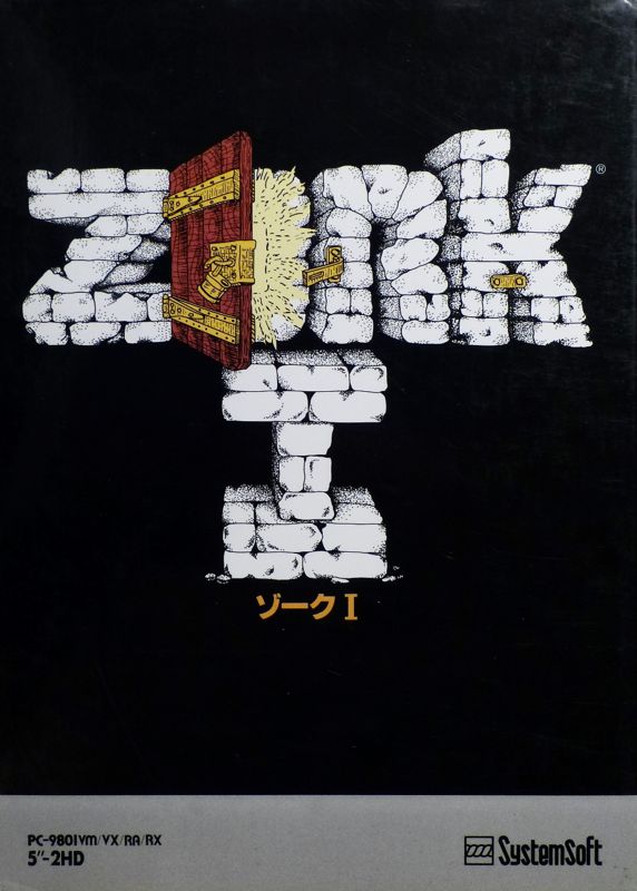
The Japan PC-98 variant has shinier bricks and feels like someone redrew the original cover.
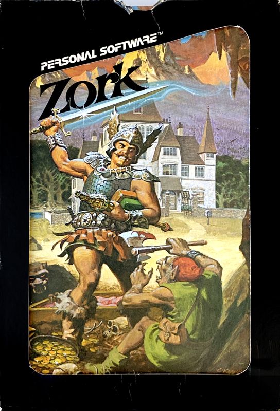
There is also the Apple II one, which just looks like curbstomping the poor goblin folk to me:
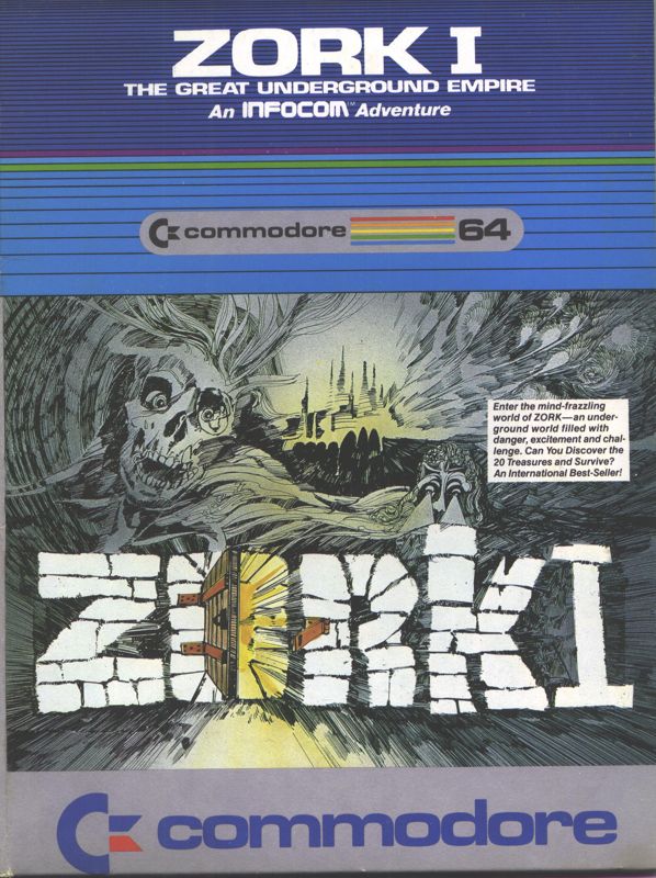
Then there is this Commodore 64 one with the meticulous line art. It also puts the numeral right next to the other bricks:
And the Commodore 64 one where they’re barely trying:
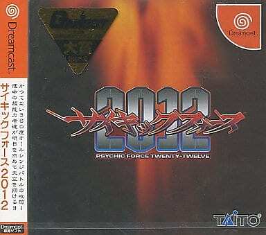
Psychic Force 2012 (Dreamcast, Japan)
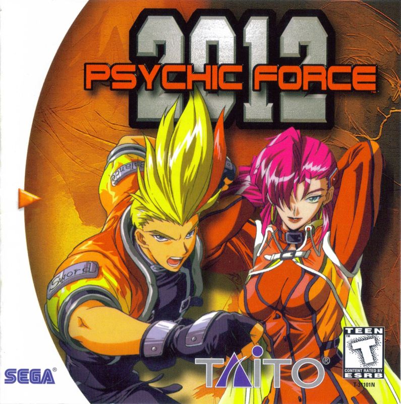
Psychic Force 2012 (Dreamcast, US)
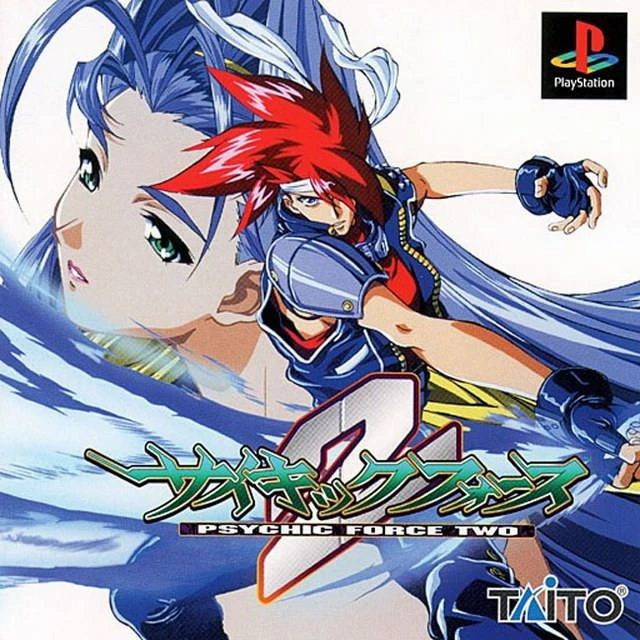
Psychic Force 2012 (Playstation, Japan)
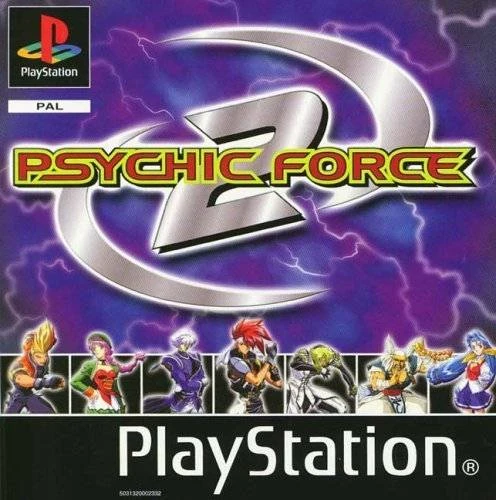
Psychic Force 2012 (Playstation, US)
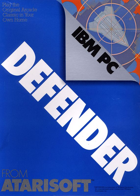
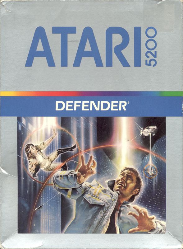
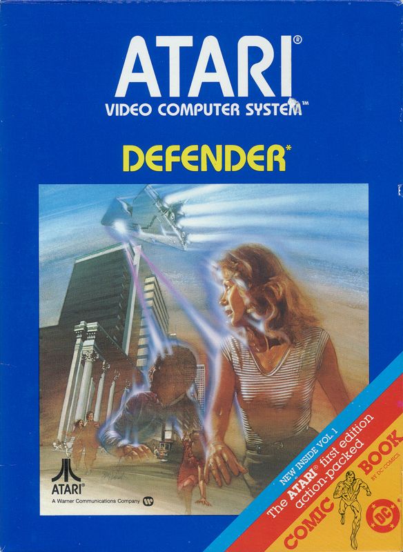
Early 1980s title Defender went through a few different styles.
The first style is solid colors based on the platform: blue (PC Booter), red (Apple II), pink (Intellivision), green (Commodore 64) and orange (ColecoVision).
The second for the Atari 5200 feels very Tron.
The Atari 2600 has the same idea with different art and less futuristic architecture. This one feels more like ZPG.
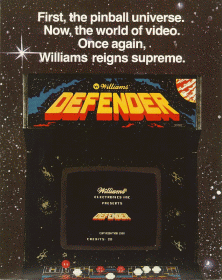
Just for reference, all of these boxes are adapting this arcade game: